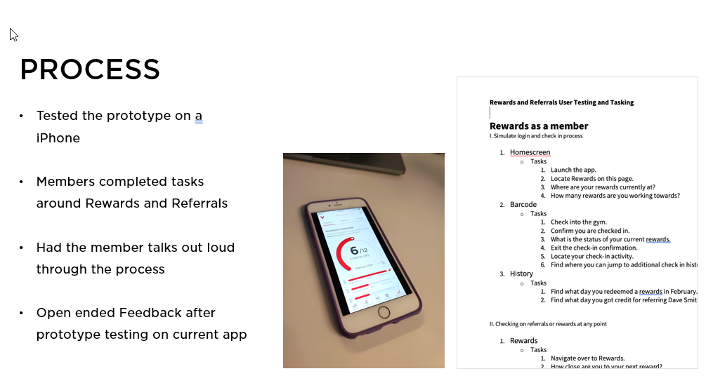
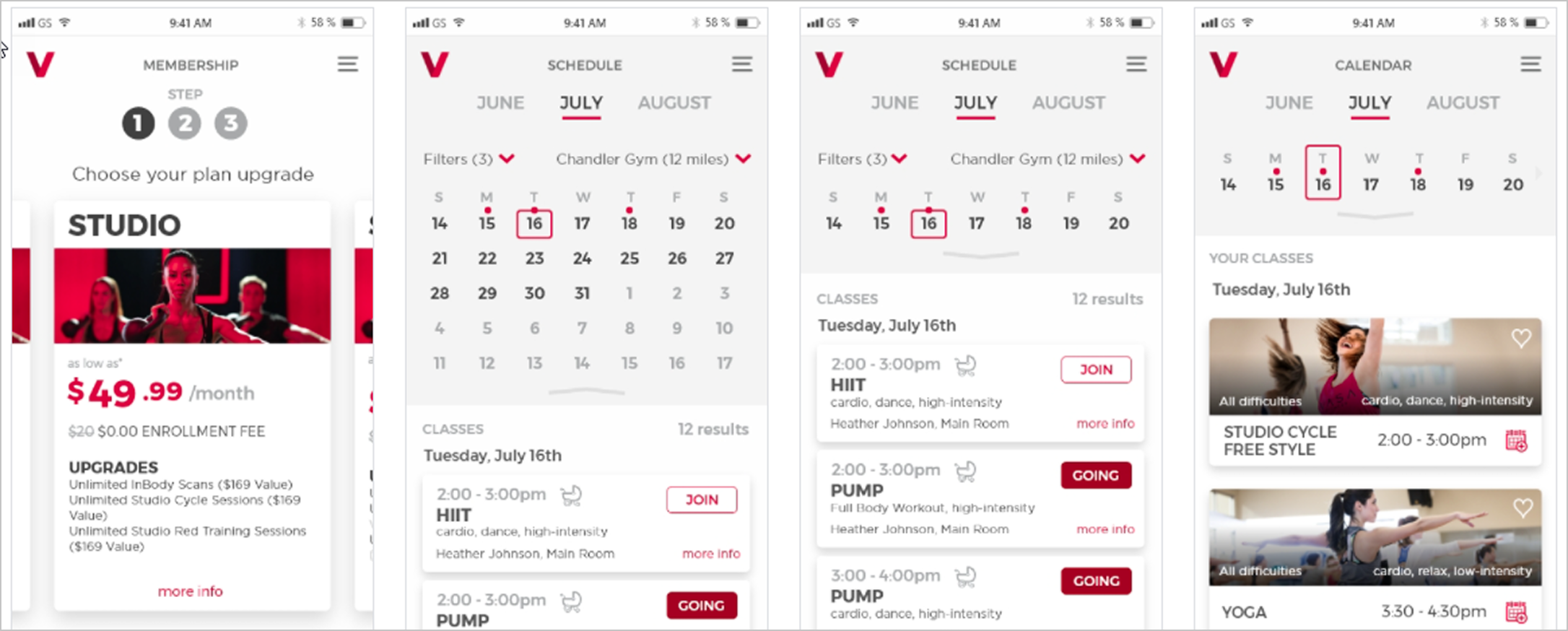
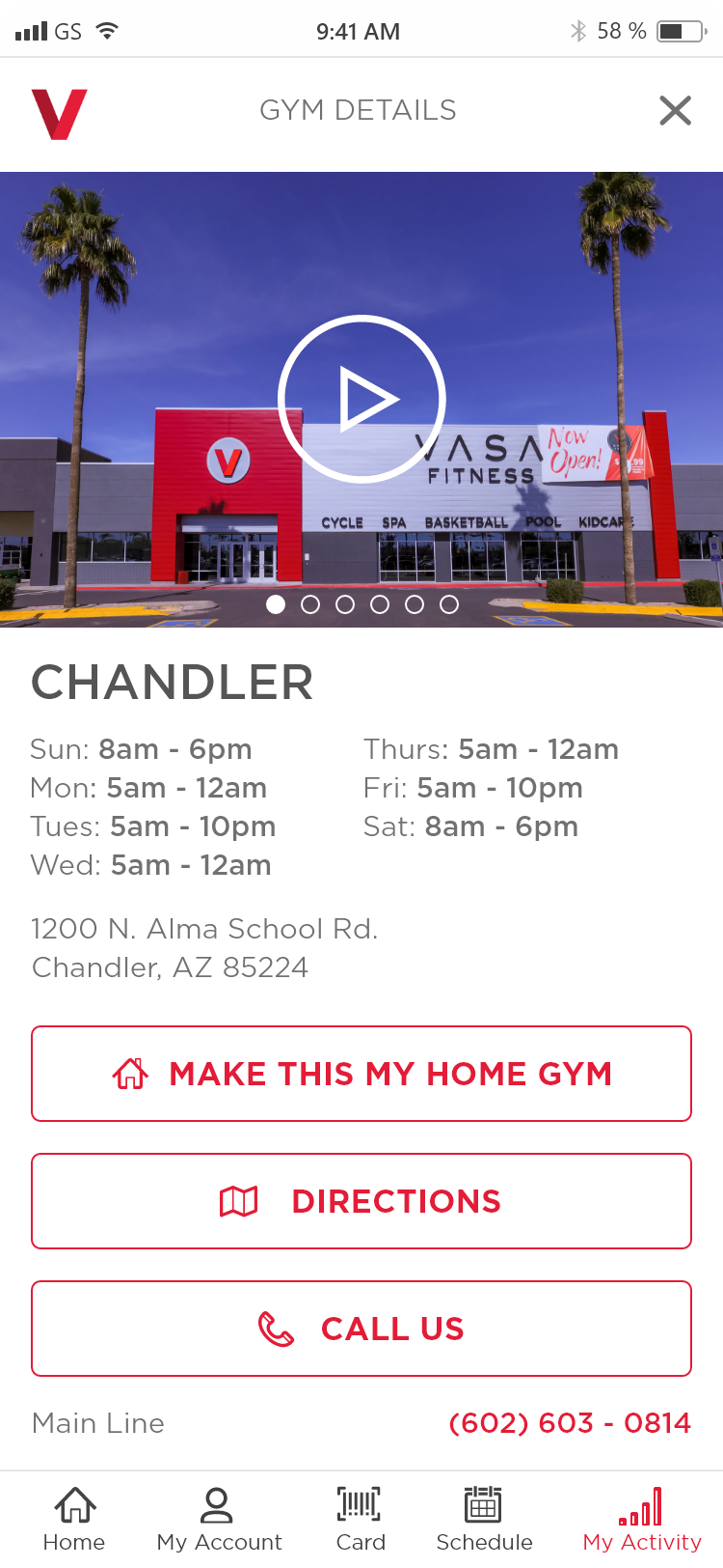
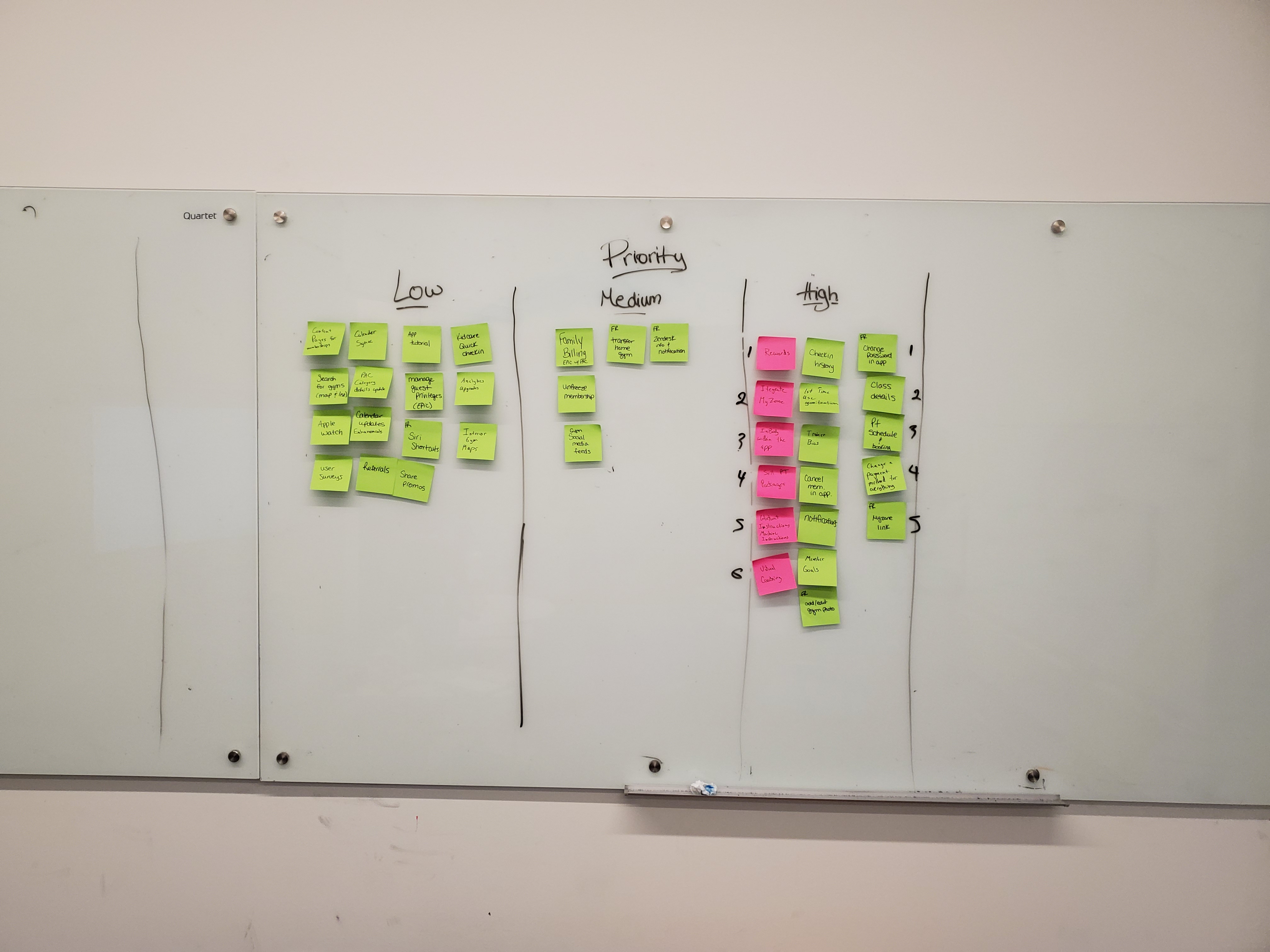
All work
Case Study — VASA Fitness Mobile App  ·  9 min read
Consumer Mobile Fitness

Better Than Starbucks

How a 10-person team built what Starbucks couldn't with 70. Replacing a broken white-label gym app with a custom native experience — shipped to both app stores in under six months, through a pandemic, with a junior dev team and a timeline that shouldn't have worked.

Client VASA Fitness
Agency Neudesic
Role UX Designer → UX Lead
Timeline 2019 – 2021 · 13 months
Platform iOS · Android Native
VASA app mockup overview
300k
App installs within three months of launch
$150k
In direct app revenue post-launch
4.3★
App Store rating across nearly 7,000 reviews
<6mo
From kickoff to both app stores
  • Led UX across iOS and Android for a 10-person cross-functional team
  • Defined product direction to replace an underperforming white-label app
  • Established decision-making frameworks (card sorts, priority matrices) to reduce misalignment and scope creep
  • Bridged client leadership and delivery team — presenting to C-suite stakeholders and running side-by-side dev reviews
  • Mentored junior engineers through hands-on design reviews, raising implementation quality across both platforms
  • Introduced usability testing cadence that directly shaped feature priority across three phases

Ten people, two platforms, six months

VASA Fitness, a national gym chain, needed a real mobile app. What they had wasn't working, and they needed it live in both app stores by Thanksgiving — less than six months away.

Our team was about ten people, all Neudesic. A couple of senior leads and a group of junior developers — several building their first native iOS or Android app. The timeline was set before we were staffed, the client was still figuring out what they wanted, and nobody on the team had worked together before. Classic consulting project: chaotic, fast, and exciting.

A white-labeled app nobody liked

VASA's existing app was a Netpulse white-label — a generic template shared across dozens of gym brands. All of VASA's real member data — accounts, class schedules, payments, KidCare reservations — lived in a completely separate system called PAC. The two systems didn't talk to each other.
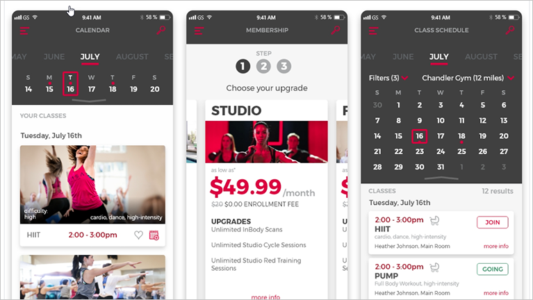
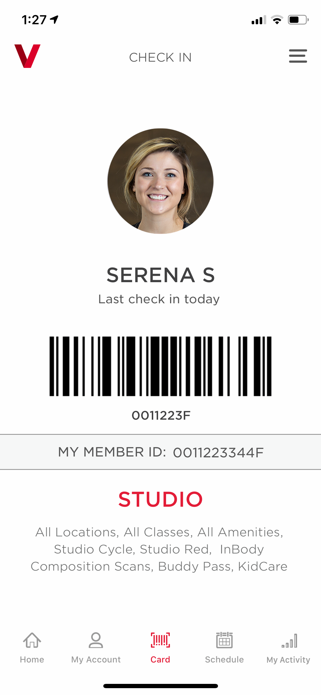
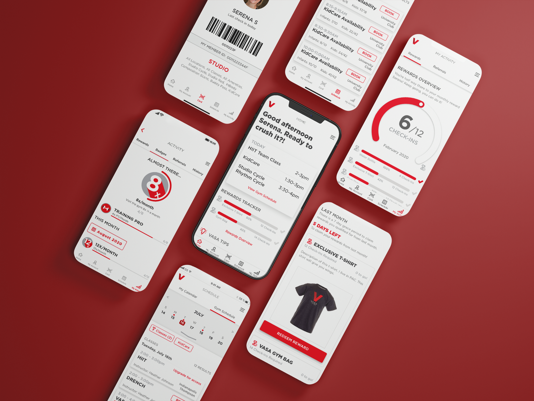
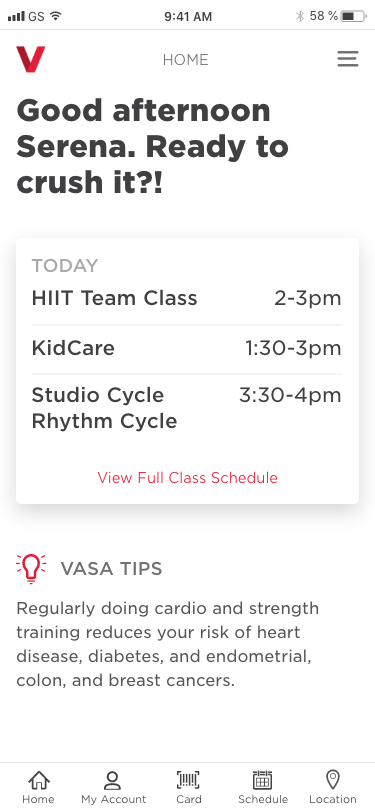
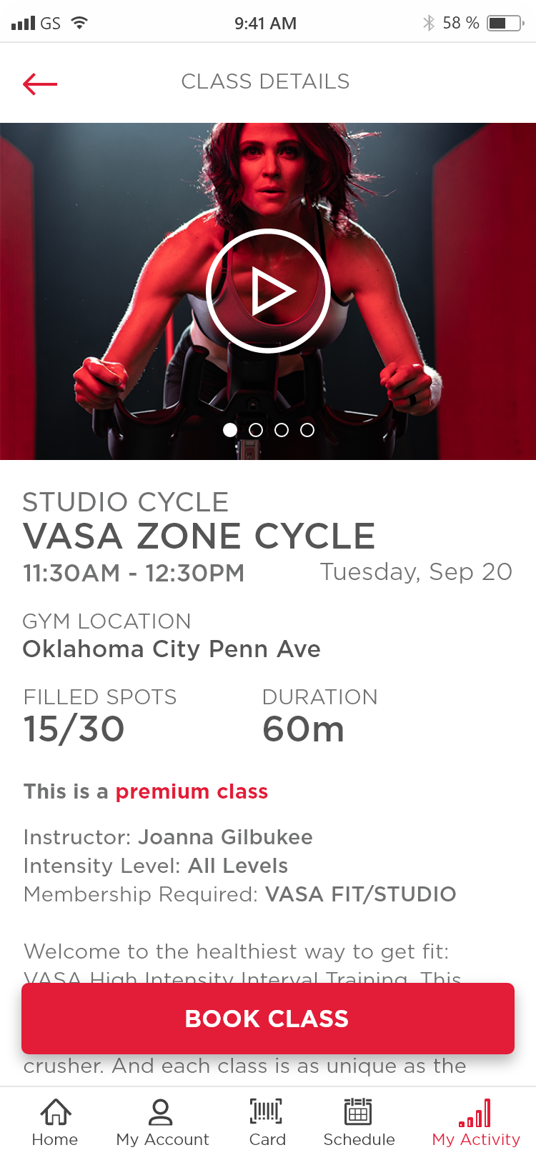
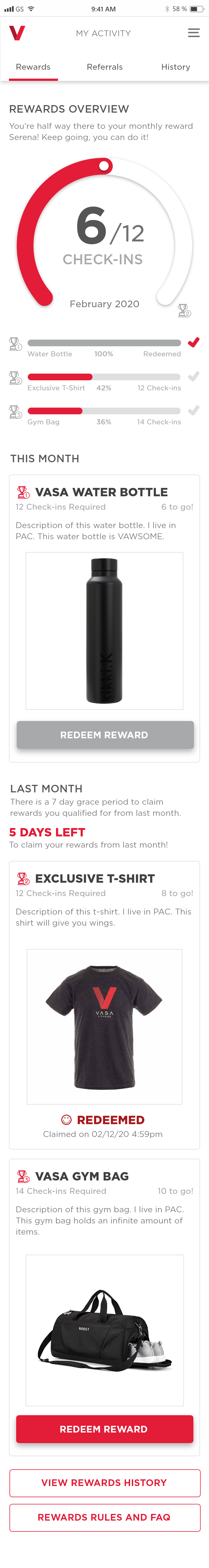
The result was maddening: members opened the app, logged in, then got launched into a browser window where they had to log in again to a different system just to see their class schedule. Two logins, two interfaces, no continuity.

The member we kept coming back to throughout the project — a single mom in her early thirties who drops her two kids at KidCare before her morning class — couldn't do the thing she needed most. KidCare scheduling wasn't available through any digital system. She had to call the front desk every time. We wanted her to open the app on Sunday night, schedule her KidCare and classes for the week in two minutes, and move on. That was the bar we designed toward.

Netpulse existing app
The old app was a marketing brochure pretending to be a product. The data told us our job was to give it an identity.

What eight thousand members told us

Before we designed a single screen, we surveyed over 8,000 VASA members. The scale of that response was unusual for a project like this — it gave us a dataset that was hard to argue with when it came time to make priority calls.

Three findings shaped the entire product direction.

18mo
Average member dropout — retention was the core business problem
70%
Of members on iOS — informed platform priority and design investment
#1
Member frustration: no account access or management in the app

The single loudest frustration across thousands of responses was simple: members couldn't access or manage their own accounts through the app. Not "we want fancier features" or "the design feels dated." Just: let me see my own account. Let me book a class without logging in twice.

Designing inside someone else's system

Every feature we designed had to work within the API boundaries of PAC, the third-party platform that held all of VASA's member data. PAC wasn't built to power a modern mobile app — it was built to manage gym operations from the back office. So it wasn't enough to ask "what's the best experience?" We had to constantly ask "what can PAC actually give us?"

KidCare scheduling was a perfect example. No system supported it digitally — members had been calling the front desk. We worked with PAC to figure out what data was available, what scheduling logic could be built on top of it, and how to present it as something that felt native. From the member's perspective, it just worked. She had no idea what was happening underneath.

Extending the brand into a new medium

VASA's brand lived in marketing — billboards, gym signage, promotional flyers, and a sales website built to convert, not retain. None of it was designed for a product. Translating that into a native mobile experience meant creating a visual language the brand had never needed before. I worked directly with VASA's Chief Brand & Marketing Officer, Mindi Bridges, through rounds of moodboards, style tiles, and early concept designs to lock the visual direction before building a single production screen.

That early investment paid dividends: when design questions came up later, we had a shared vocabulary vetted at the top, which meant I could move fast and make visual decisions with confidence rather than looping back for approval on every screen. From there, I designed over 390 screens across three major phases and multiple updates.


Teaching developers to see

Design on this project wasn't a handoff — it was a continuous loop. Screens went into Figma, builds came back from developers, and we iterated in real time. What I designed this week was often in a build next week, which meant design decisions had to be made fast, communicated clearly, and revisited constantly.

But speed only works if the people building your designs understand them. About two-thirds of the development team were junior engineers learning native iOS or Android for the first time. Rather than treat them as downstream executors, we pulled them in early — into workshops, into whiteboard sessions, into the messy front-end of the design process where decisions were still being made. When developers understand why a design exists before they write a line of code, they build it differently.

I also started doing side-by-side reviews once builds came back. I'd sit with a developer, pull up the build on a device next to the design in Figma, and we'd walk through it together — talking through intent. Why this spacing exists. What the user is trying to accomplish on this screen and how the layout supports that. It wasn't just QA — it was teaching them to see the design the way a designer sees it.

At peak velocity, that 1:5 designer-to-developer ratio meant I spent 50–70% of each working day in these reviews. It was exhausting, but it was the single most important thing I did for product quality.

That review cadence became the team's operating model for the rest of the engagement.

The return compounded over time. Developers started catching issues on their own, asking better questions before building, and developing an instinct for when something looked off. By Phase 2, the gap between design intent and built output had narrowed significantly — not because the designs got simpler, but because the team had internalized how to read them.

What members showed us we got wrong

We didn't just ship and hope the numbers would tell us if it worked. Throughout the project, I ran guerrilla usability testing sessions at VASA gym locations — walking up to real members with prototypes on a phone, watching them try to complete tasks, and listening to where the design broke down. Across the project I tested with roughly 6 to 12 members, focused on the three flows that mattered most: class scheduling, KidCare booking, and the membership purchase process.

Filtering tripped people up — twice. The same problem surfaced in two different flows. In class scheduling, members struggled to filter and find the right class — the filter patterns we'd designed made sense to us but created confusion in practice. The same pattern repeated in KidCare booking. Seeing it in two flows made it impossible to ignore — this wasn't an edge case, it was a pattern in our design language that needed to be rethought. We simplified the filter interactions across both flows: clearer entry points, fewer steps, and interactions that felt invisible.

The membership purchase flow needed to breathe. In testing, the length of the flow created friction. Members weren't sure how far along they were, and the density of information on tier comparison screens made it hard to focus. We made a series of refinements — clearer step progression, streamlined screens, and a more scannable tier comparison. The flow was still detailed — it had to be — but it no longer felt like a slog.

After making changes, I went back to the gyms and put the revised prototypes in front of members again. The friction points were gone. That second round gave us the conviction to lock the designs and move into development, knowing the core experience had been validated by the people who'd actually use it.

The survey told us what to build. Guerrilla testing at the gyms told us whether we built it right. Going back a second time told us we had.

The platform tradeoff

The Phase 1 launch target was November 2019 — timed to a Thanksgiving marketing push. Less than six months from kickoff to both app stores, with a junior dev team and third-party API dependencies.

As the deadline closed in, it became clear we couldn't deliver the same quality on both platforms. The iOS experience was strong — the version the C-suite ended up raving about. Android was functional but carried compromises. My role wasn't deciding the tradeoff, but making sure what we shipped still made sense as a product — focusing design effort where it would have the most impact, tightening core flows, and working closely with developers to ensure that even where we cut corners, the experience held together.

With roughly 70% of VASA's members on iOS, we were delivering a high-quality experience to the majority while replacing something broken for everyone else. We treated Android as a gap to close, not a permanent state.

Phase 1 — November 2019
Initial Launch
What shipped in Phase 1 was the core product: barcode check-in, class and KidCare scheduling, a membership purchase flow, gym locations, a homescreen, and — critically — real account access. Members could finally see their own membership information inside the app that bore their gym's name.
Barcode Check-in My Account Class Scheduling KidCare Scheduling Membership Purchase Gym Locations Homescreen

The Starbucks comparison

Shortly after launch, a message from Mehul Chaudhari — VASA's VP of Strategy and Analysis — made its way to our team through Slack. It got screenshotted and passed around to every person on the project.

"Just got a call from our CEO/CMO/CFO who are using the app today to book classes and got feedback from the club. They said it was awesome and were super happy with it. They made an app at Starbucks with 70 developers and a bunch of other folks and couldn't release it in the same timeframe or for the same cost."

— Mehul Chaudhari, VP of Strategy and Analysis, VASA Fitness

That's the kind of thing you hold onto in consulting. You don't always get to hear how the work landed — you hand off the project and move on to the next one. When a client's entire C-suite is using your app to book their own gym classes and comparing it favorably to what Starbucks built with seven times the headcount, it tells you the work connected.

4.3★
App Store rating across nearly 7,000 reviews — still holds today
300k
Installs within three months of launch
$150k
In sales flowing directly through the app post-launch

Then the world stopped

On March 19, 2020, VASA closed every gym in response to COVID-19. Revenue dropped to zero overnight. All vendor work halted immediately. For three months, the project didn't exist.

Before the shutdown, I'd made sure the design system and backlog were in a state where any team could pick them up — which turned out to matter more than I expected.

When VASA reopened and started bringing vendors back, Neudesic was one of the first calls they made. That decision — reinvesting in the app before most other vendor relationships — was a direct result of the trust built during Phase 1. That trust eventually led to two additional projects during the pandemic recovery, when every budget line was being scrutinized.

Deciding what to build next

After launch, the feature backlog exploded.

Feature prioritization

I facilitated a card sort exercise with Mehul Chaudhari to force prioritization — laying out every candidate feature, mapping them against member impact and technical feasibility, and sorting them into a sequenced roadmap. It turned a sprawling wishlist into a focused plan the entire team could align around.

My job wasn't just to design the features — it was to help the client decide which features deserved to exist at all.

With the roadmap locked, Phase 2 deepened member engagement. We added member referrals, check-in history, profile photo uploads, the ability to change your home gym, and a gamification system with badges — features designed to make the app feel personal, not just functional.

The structural call

One structural call I wish we'd made earlier was splitting iOS and Android into dedicated teams. In Phase 1, developers were context-switching between platforms, losing momentum on both. By Phase 2, I advocated for the split, and once it happened, velocity improved immediately. It's the kind of process decision that doesn't feel like design work, but it directly affected what we could ship and how fast.

Phase 2 — 2020
Member Engagement Features
Member Referrals Check-in History Profile Photo Upload Change Home Gym Gamification Badges
Phase 3 — September 2021
Rewards Program
Phase 3 introduced a full rewards program integrated with a third-party vending platform. Members could track points, see their rewards overview, and redeem directly through the app. It created a new retention loop — a reason to open the app even on days you didn't go to the gym.
Rewards Overview Points Tracking Homescreen Rewards Widget In-App Redemption

From designer to decision-maker

Six months into the engagement, the principal designer moved on. By that point, I was already running the design-dev collaboration, presenting directly to VASA's leadership, and making product-level calls — so the transition to UX Lead formalized a role I'd been growing into since the first sprint. I was no longer just designing screens — I was presenting directly to VASA's stakeholders, defining the product roadmap, writing user stories, managing the backlog, and keeping priorities aligned across a team that now spanned multiple workstreams and two platform-specific dev groups.

I became one of the primary communicators between VASA's leadership and our delivery team — translating business goals into design direction in stakeholder meetings, then translating design intent into implementation specifics in developer reviews. Two different audiences, two different languages, same product vision.

Ownership also meant caring about the product after it shipped. I wrote the app store update notes for each release and personally responded to user reviews — the kind of work that doesn't show up in anyone's job description but signals that someone on the team is paying attention to the full experience, not just the Figma file.

"Not only was Neudesic involved on the technical side, but they also became a strategic advisor on new features that we were looking to implement. Neudesic understood how we operate our business on a day-to-day basis and helped make recommendations. This took a lot of pressure off of our team, because we trusted that Neudesic had our best interests in mind."

— Mindi Bridges, Chief Brand & Marketing Officer, VASA Fitness

That trust came from showing up consistently — facilitating the card sorts, presenting design rationale in language stakeholders cared about, catching implementation issues before they became client-facing bugs, and being honest about what we could and couldn't deliver in a given sprint.

The relationship continued

The trust built during the mobile app engagement led VASA to bring Neudesic back for two additional projects — a tablet-based sales tool and a self-service support site — both completed during the COVID recovery period in mid-2020, when every budget line was being scrutinized.

July – August 2020 · 2 months
Sales Tool
A tablet web app for in-gym prospects — letting potential members self-serve through a purchase flow and fitness questionnaire, reducing reliance on sales staff to drive membership conversions.
Tablet Web App Self-Service Sales Flow
July – August 2020 · 2 months
Self-Service Support Site
A responsive web app to automate the most common member support calls — reducing load on VASA's customer service team and integrating with Zendesk so staff could manage help content without developer support.
Responsive Web App Zendesk CMS Support Automation

What this work proved

This project succeeded because the team learned how to make decisions quickly, align around what mattered, and move forward without perfect information.

For me, it reinforced where design has the most impact — not just in the screens, but in how decisions get made: helping a team converge, giving developers enough context to build with confidence, testing assumptions with real members, and making tradeoffs explicit so the product can actually ship.

The Starbucks comparison is the part people remember. The 4.3-star rating, the 300,000 installs, the revenue — those are easy signals. What mattered more was that the product worked, members could do what they needed without friction, and the client trusted us enough to keep going.

The platform tradeoff was the call that taught me the most — choosing to ship a strong iOS experience on time rather than a mediocre experience on both. Having the data (70% iOS users) made it defensible, but it still required the conviction to stand behind an imperfect launch.

← Back to all work Next case study Invoca Contact Center Workflow Redesign →