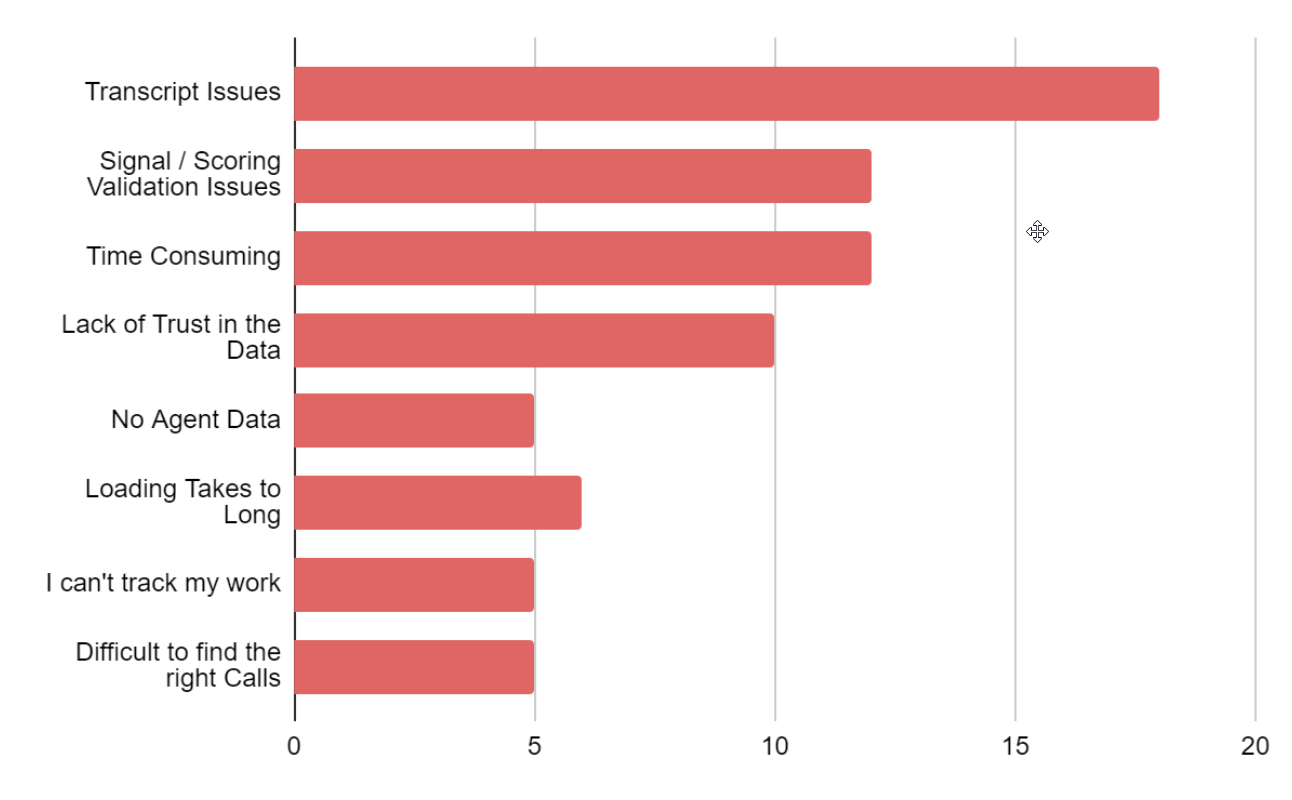
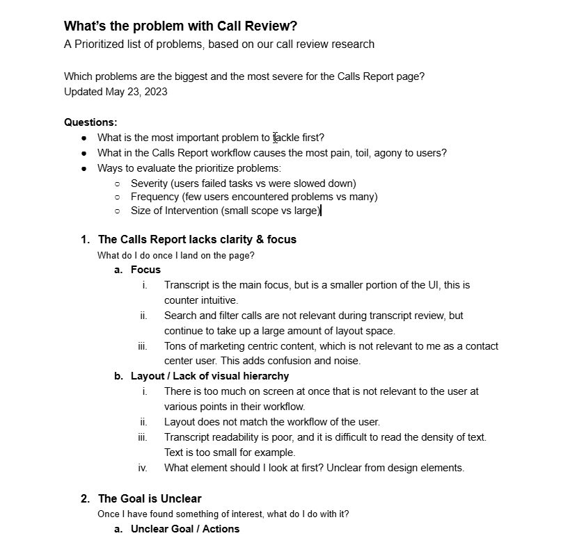
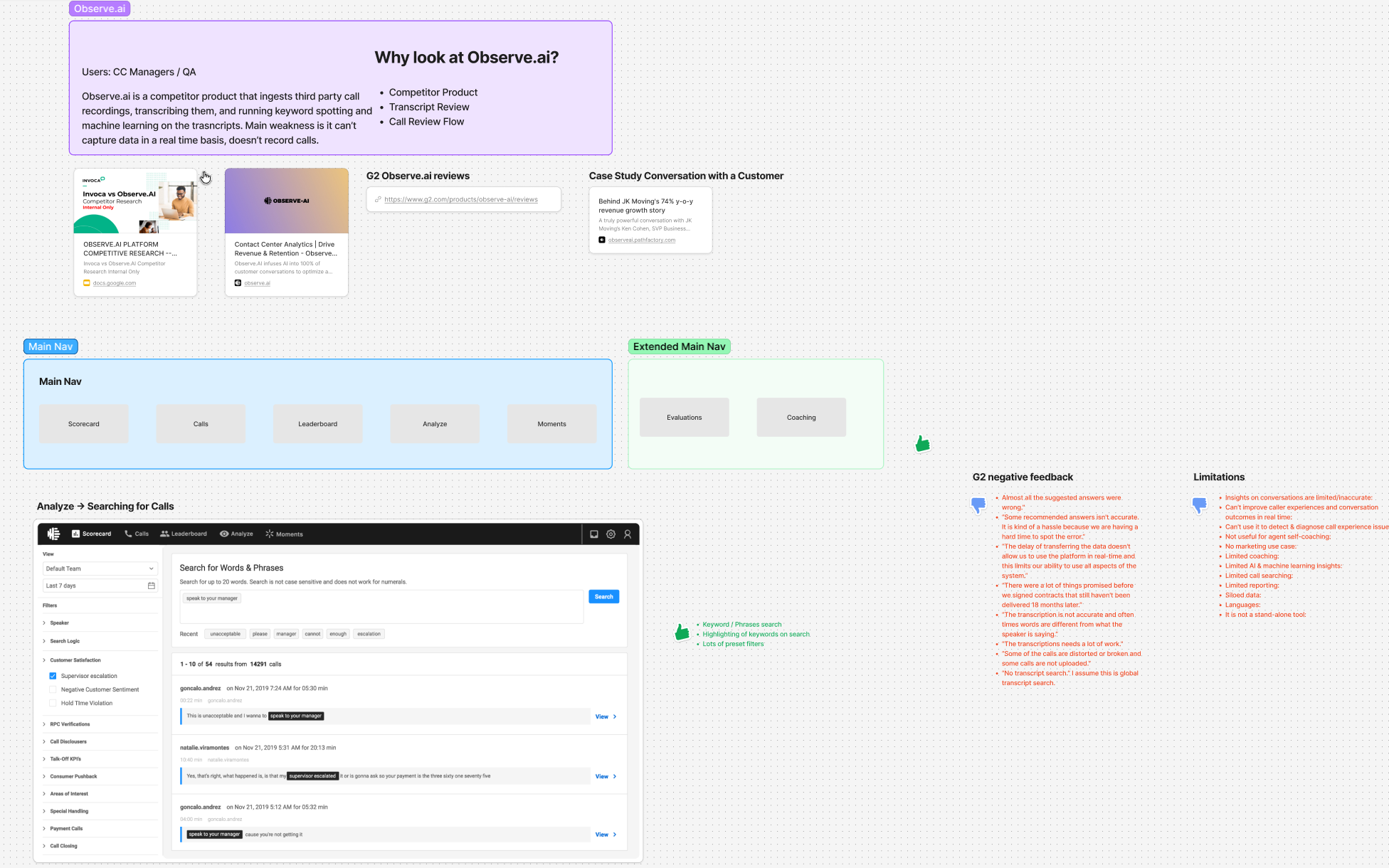
I started with a one-week research sprint I conceived and pitched to product leadership: Pendo session replays to watch how users were actually navigating the product, conversations with the internal CS team, review of accumulated research that had minimal synthesis. Within that first week, the picture was clear: the Calls Report was the center of gravity. The workflow every contact center user touched daily, and the one they struggled with the most.
CEO Gregg Johnson asked to review the project. He paused at one point to ask if this was more research than the company typically conducted before a project. That moment captured the deeper challenge. Invoca's culture leaned toward building what users asked for rather than understanding the underlying problem. So we structured the research in shorter phases that could each earn continued investment, proving value incrementally rather than asking for trust upfront.
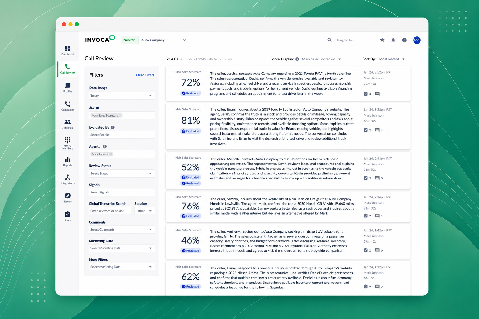
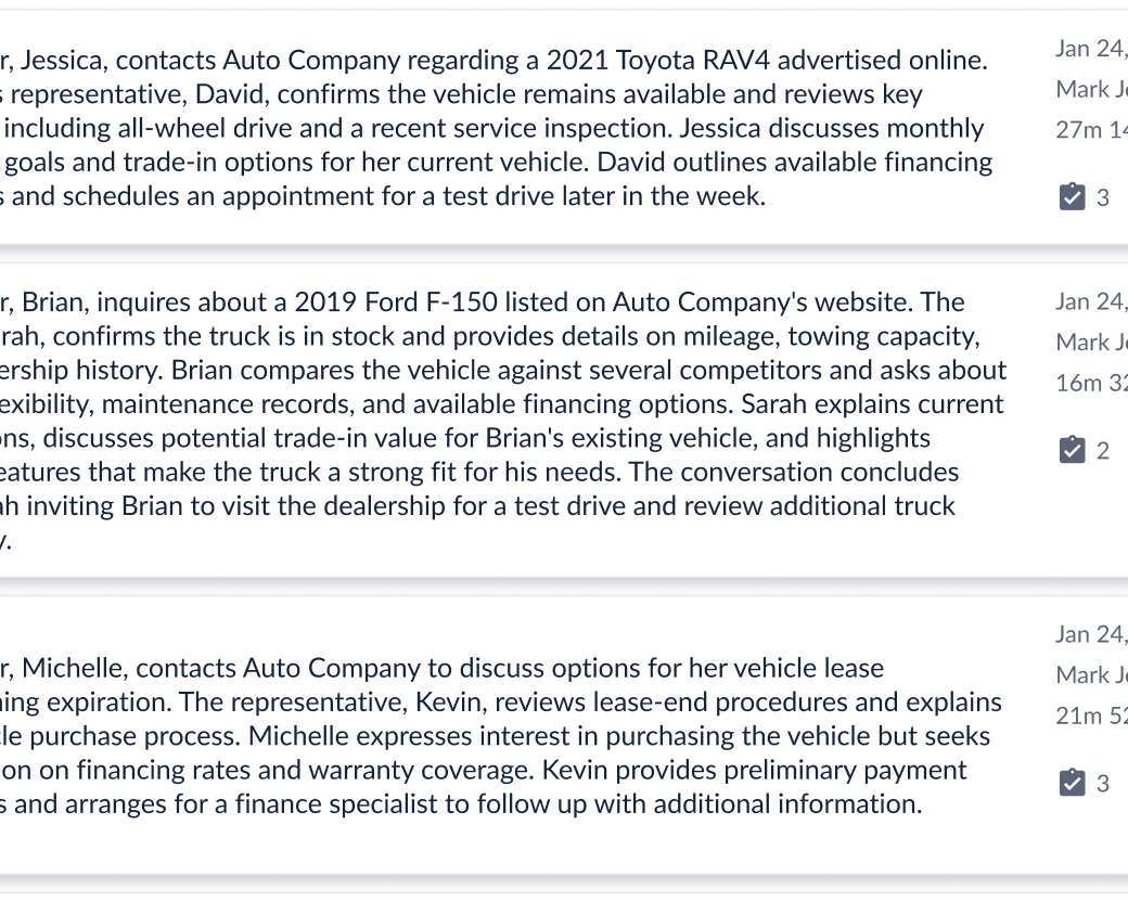
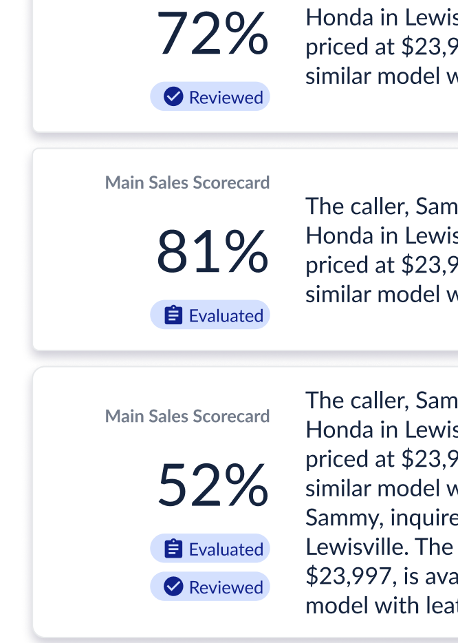
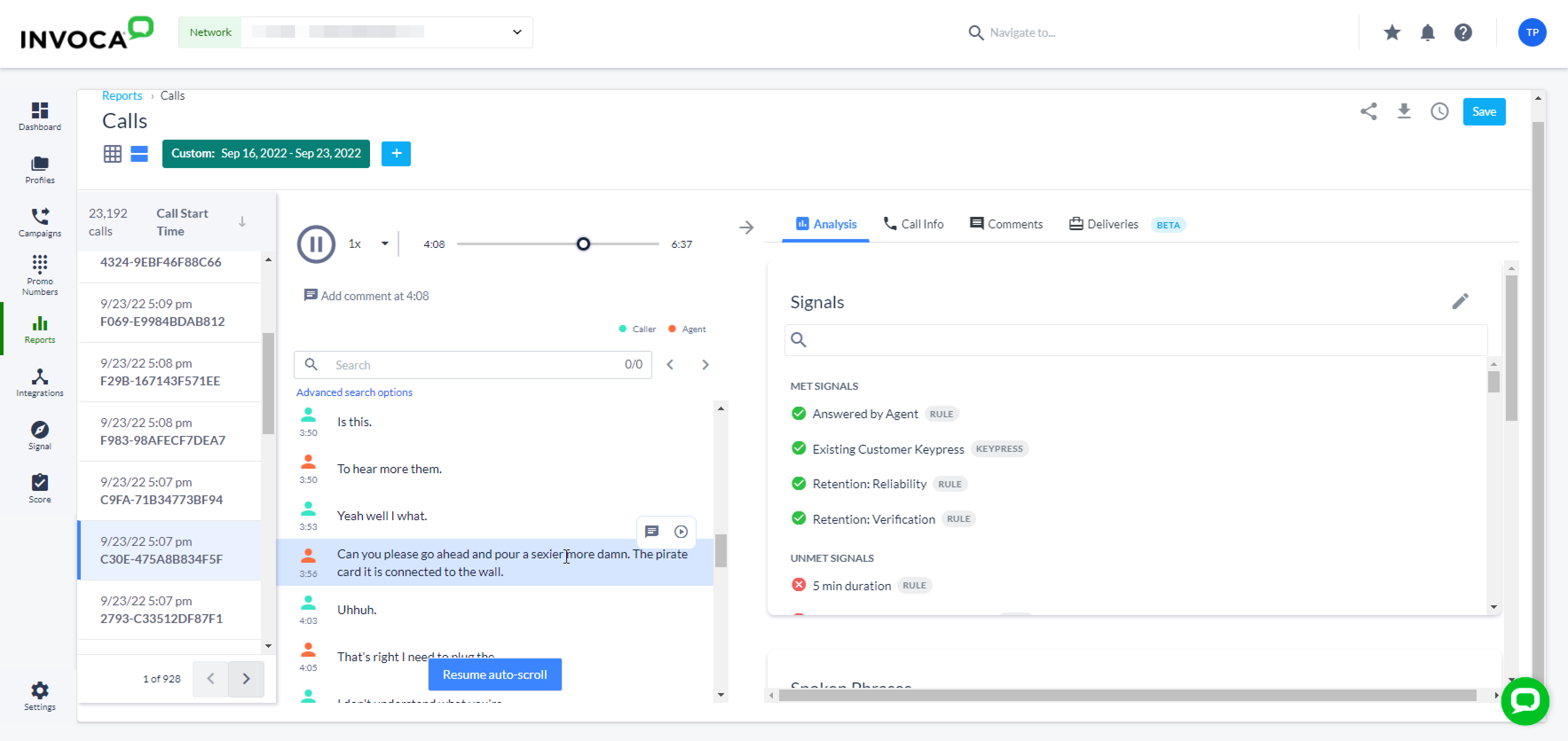
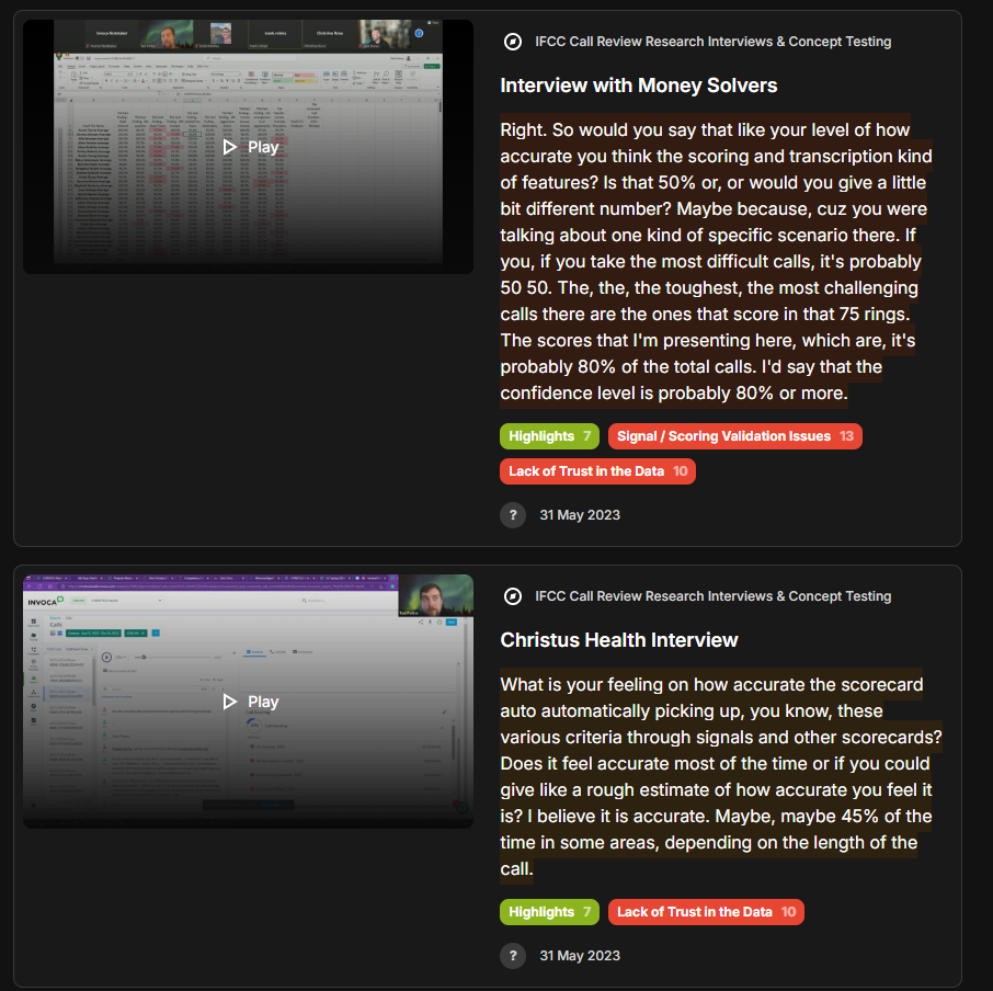
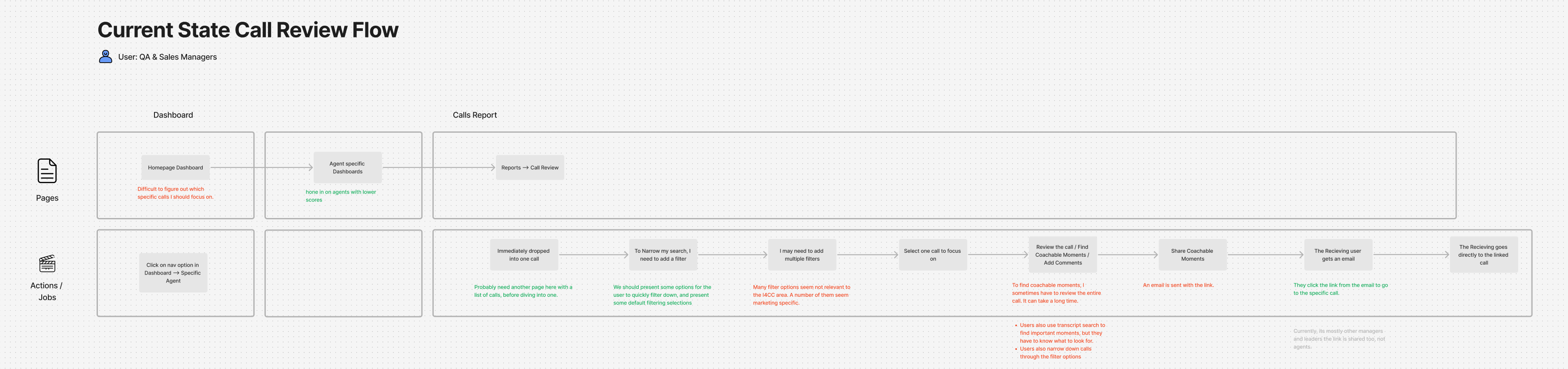
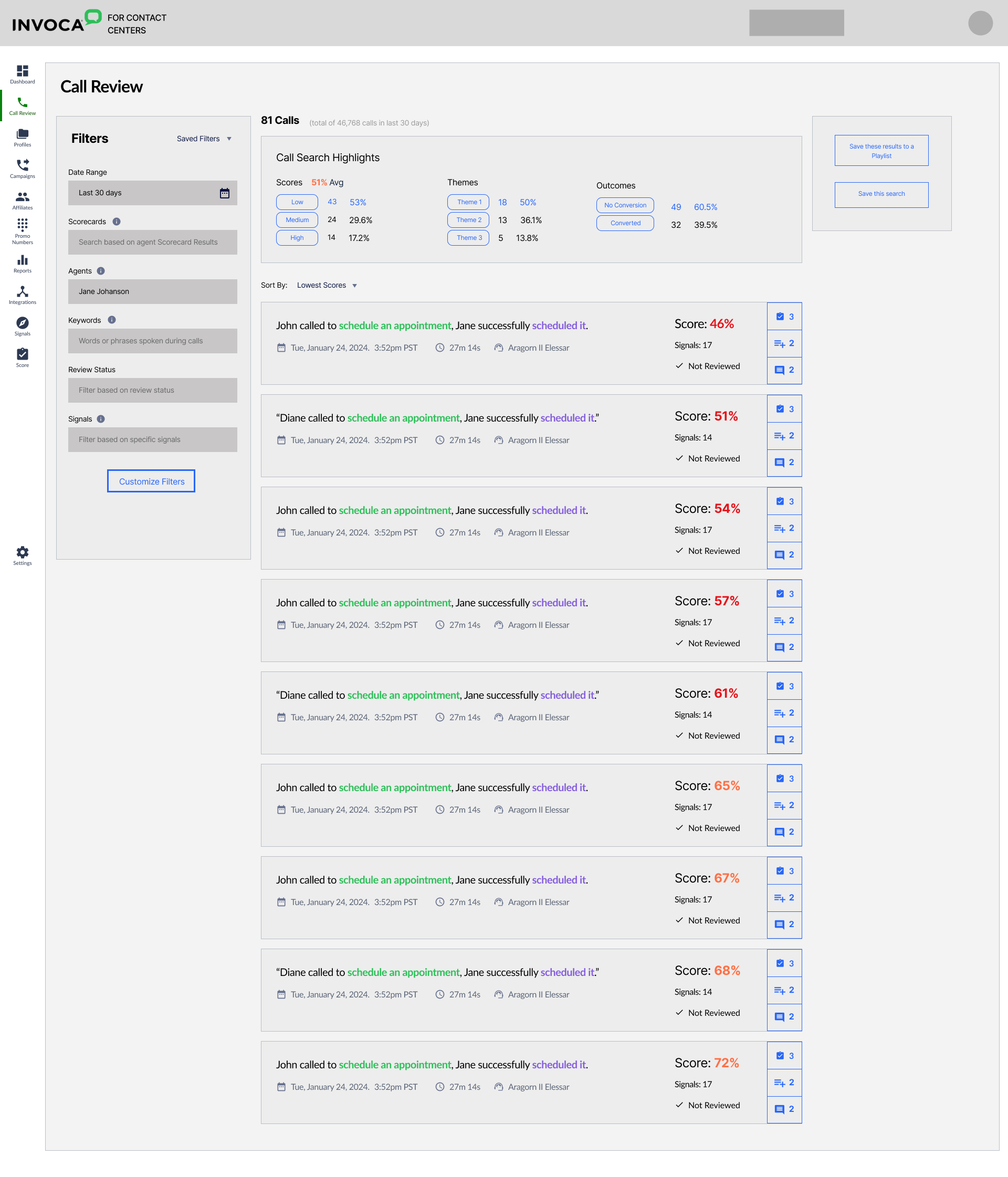
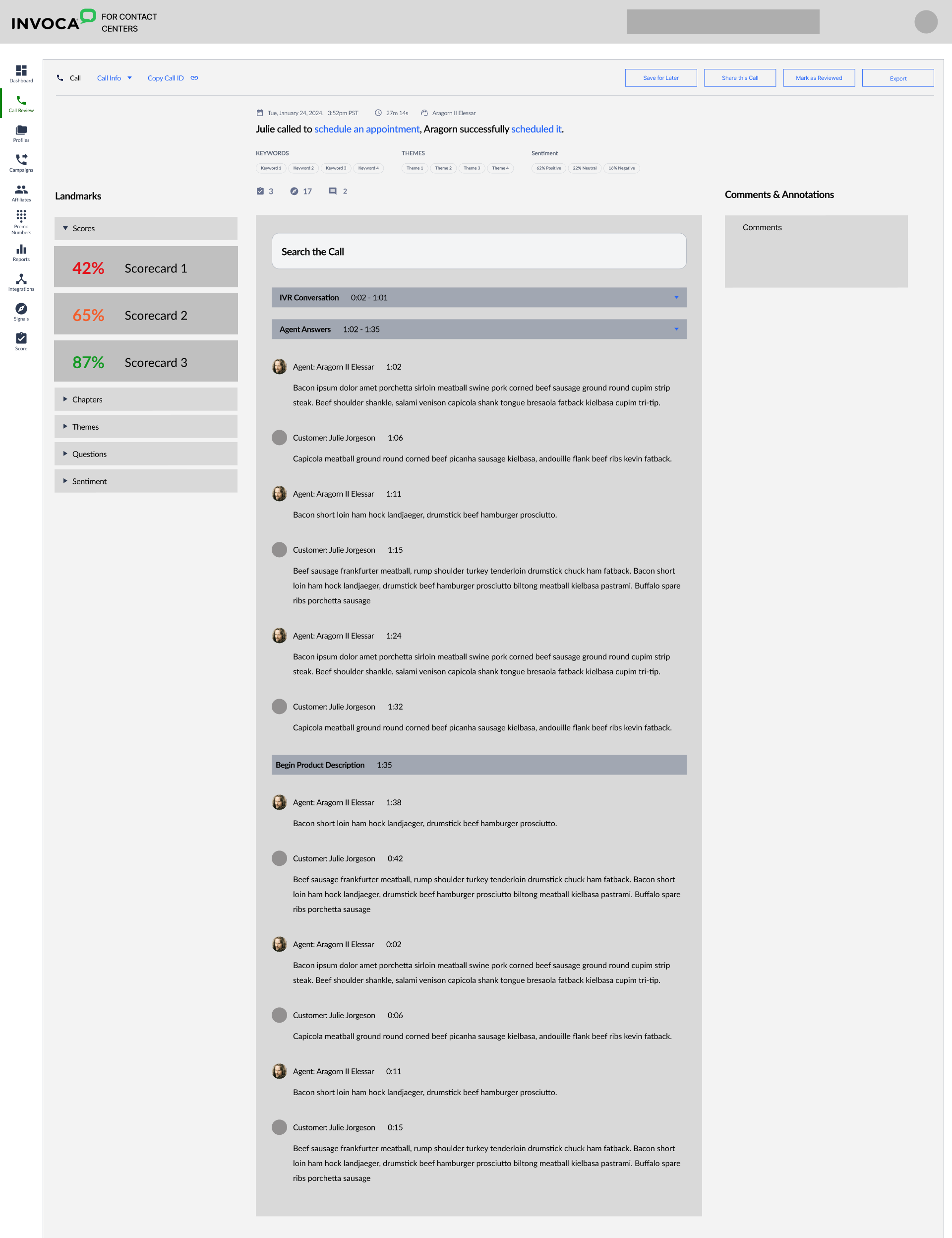
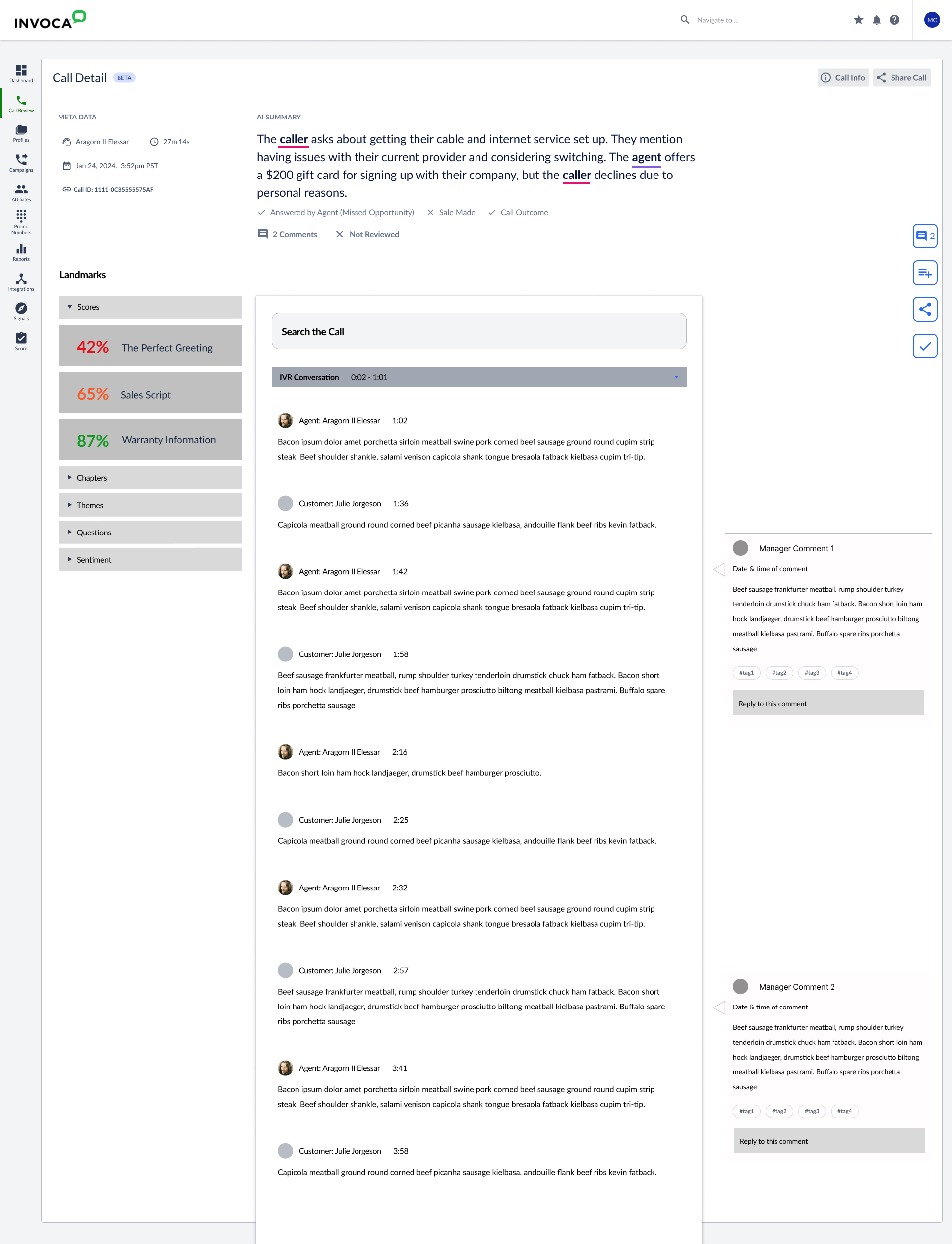
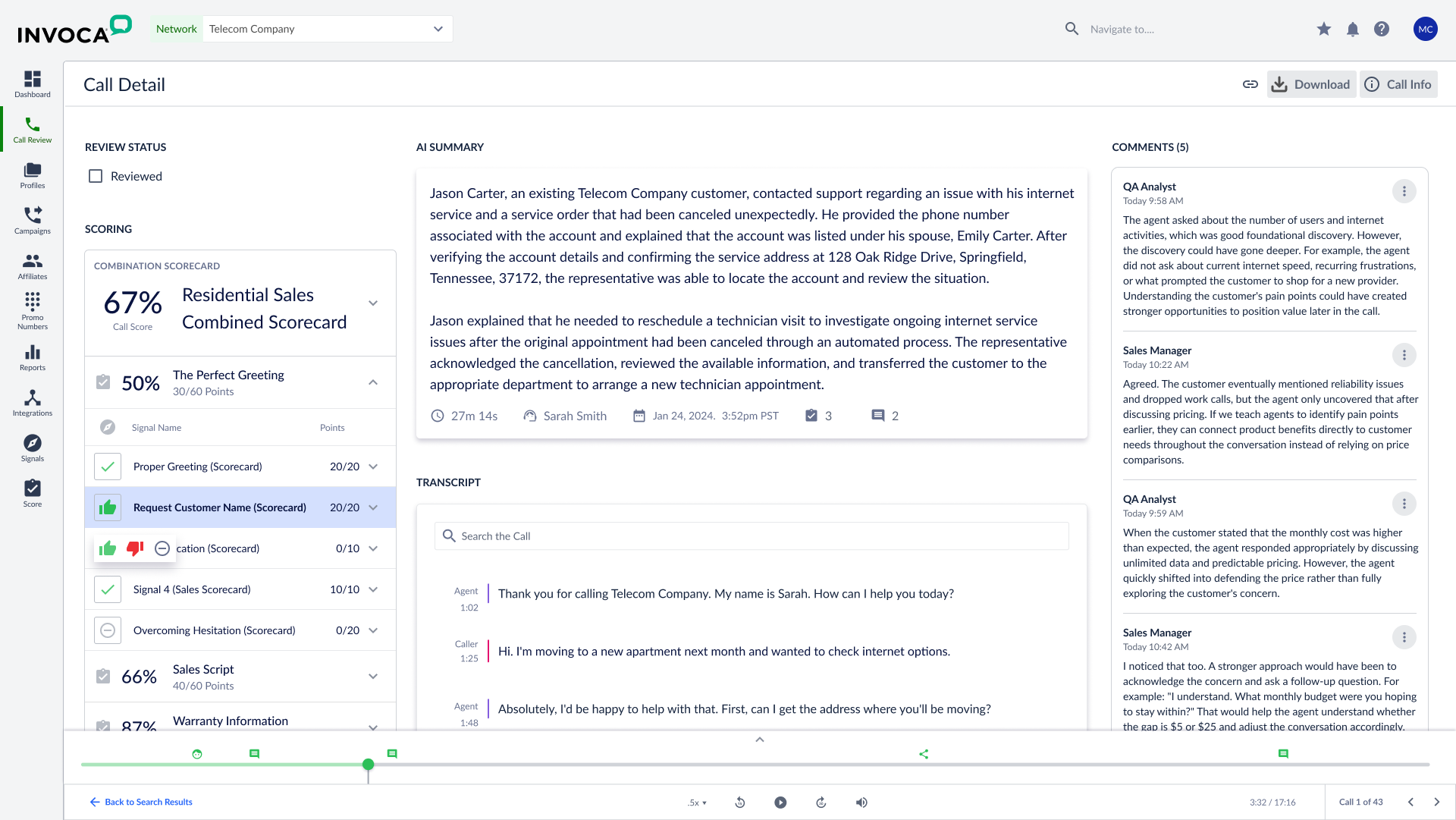
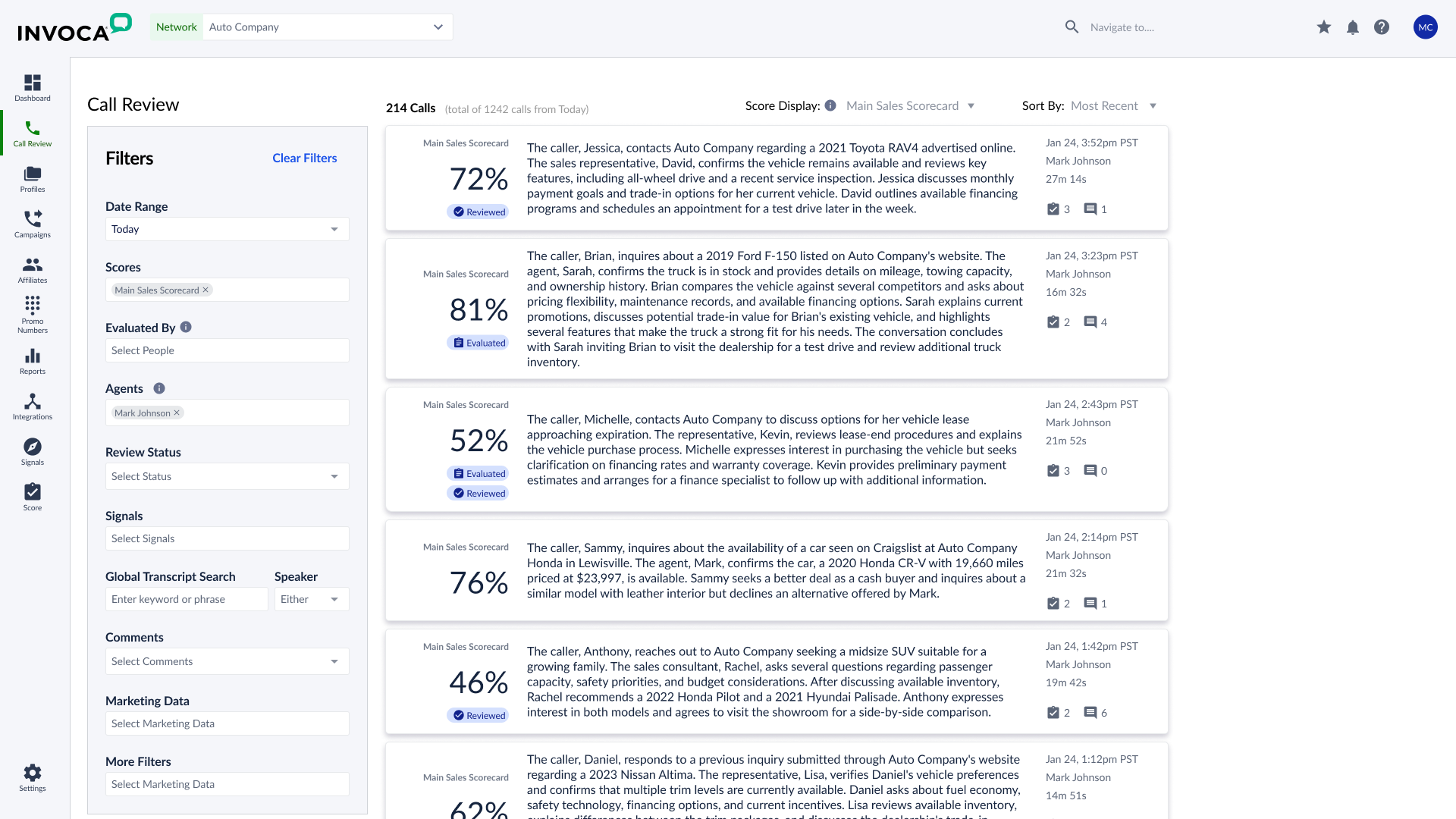
The deep dive ran for 30 days. Five customer companies, 8 users, 8 FullStory accounts analyzed. The workflow had two distinct levels: first, find calls of interest within a massive body — for some customers, millions per month. Then, find moments of interest within a specific call — the fumbled pitch, the brilliantly handled objection. The Calls Report was supposed to make both levels efficient. It wasn't. The pattern that emerged: users were spending entire workdays in a tool they didn't trust. Trust scores averaged around 50% across customers, with some as low as 10%. Without trust in the data, users were manually validating every call before they'd stake their reputation on insights or actions.
50%
Up from 10%, still not comfortable
"Right now I'm personally not comfortable that we're there yet, but I am comfortable that we will get there."
Ronnie Brown
Telesales Coach, T-Mobile
45%
On certain call types
"I believe it is accurate. Maybe 45% of the time in some areas, depending on the length of the call."
Sherita Vance
Health Plan Coordinator, Christus Health
50%
On the toughest calls
"If you take the most difficult calls, it's probably 50/50."
Mark Roblez
Call Center Director, Money Solvers
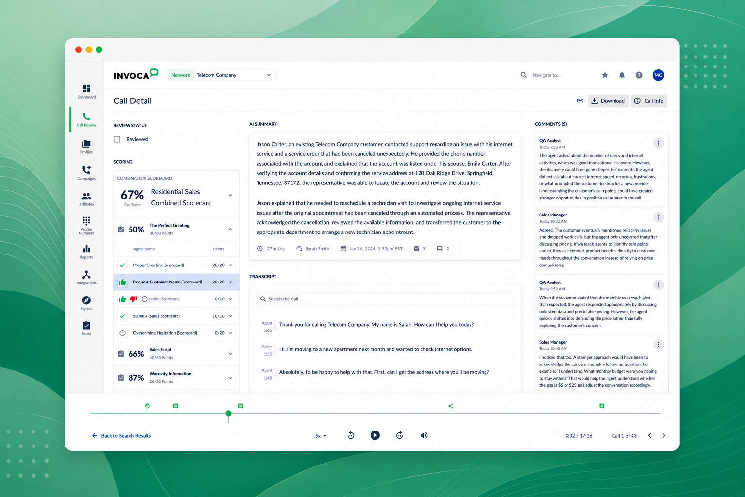
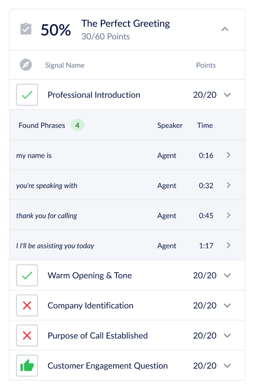
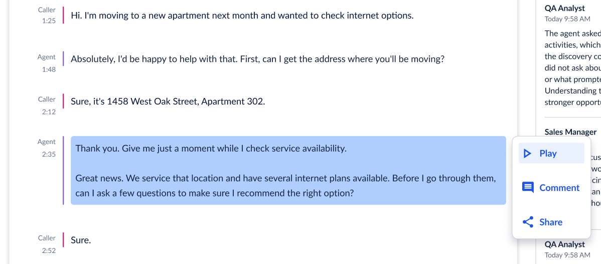
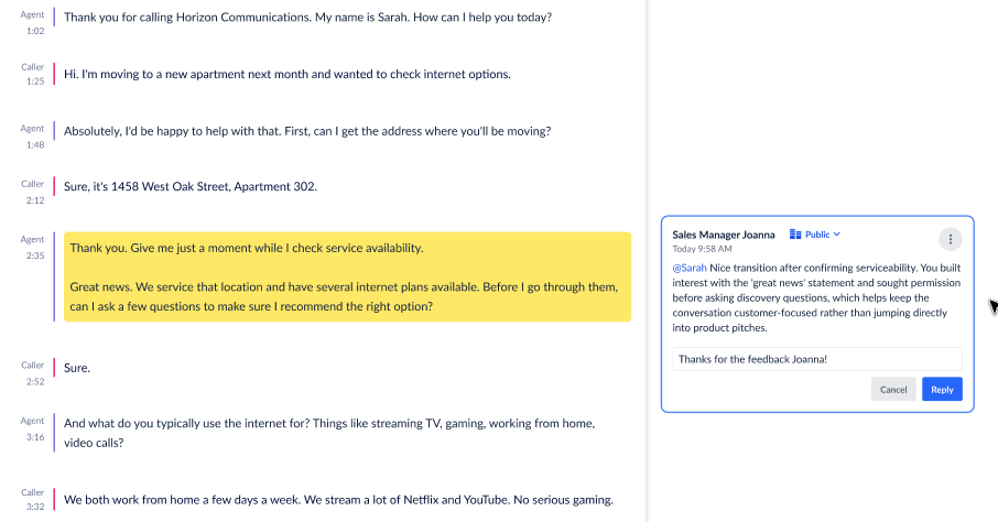
The reframe: this wasn't a UI problem, it was a trust problem. Every other issue (transcript quality, signal scoring, navigation) was a tributary feeding the same river. Until users could trust what the product told them at a glance, the workflow couldn't function as the daily driver it needed to be. That framing turned a list of complaints into a single design priority: the call review workflow needed to surface what mattered, fast, in a form users could verify in seconds.