All work
Case Study — Interos Supply Chain Risk Platform  ·  5 min read
Enterprise B2B Risk Intelligence Data Density

An Excel Sheet With a Billion-Dollar Problem

How I led design across five workstreams for a supply chain risk platform during its sprint to unicorn status, and built the UX review process that helped engineering ship it.

$1B+
Valuation reached during the engagement (unicorn status)
5
Workstreams led across the 18-month engagement
1
Junior designer mentored to independent ownership
Client Interos, an enterprise supply chain risk platform
Agency Neudesic
Role Senior UX Designer (Feature Lead)
Timeline 2021 · 18 months
Platform Web App · Enterprise SaaS
Led Discovery, end-to-end design across 5 workstreams, UX review process rollout, junior designer mentorship
Team Embedded in Interos product team across 5 workstreams alongside PMs, engineers, and internal designers

An Excel sheet pretending to be a platform

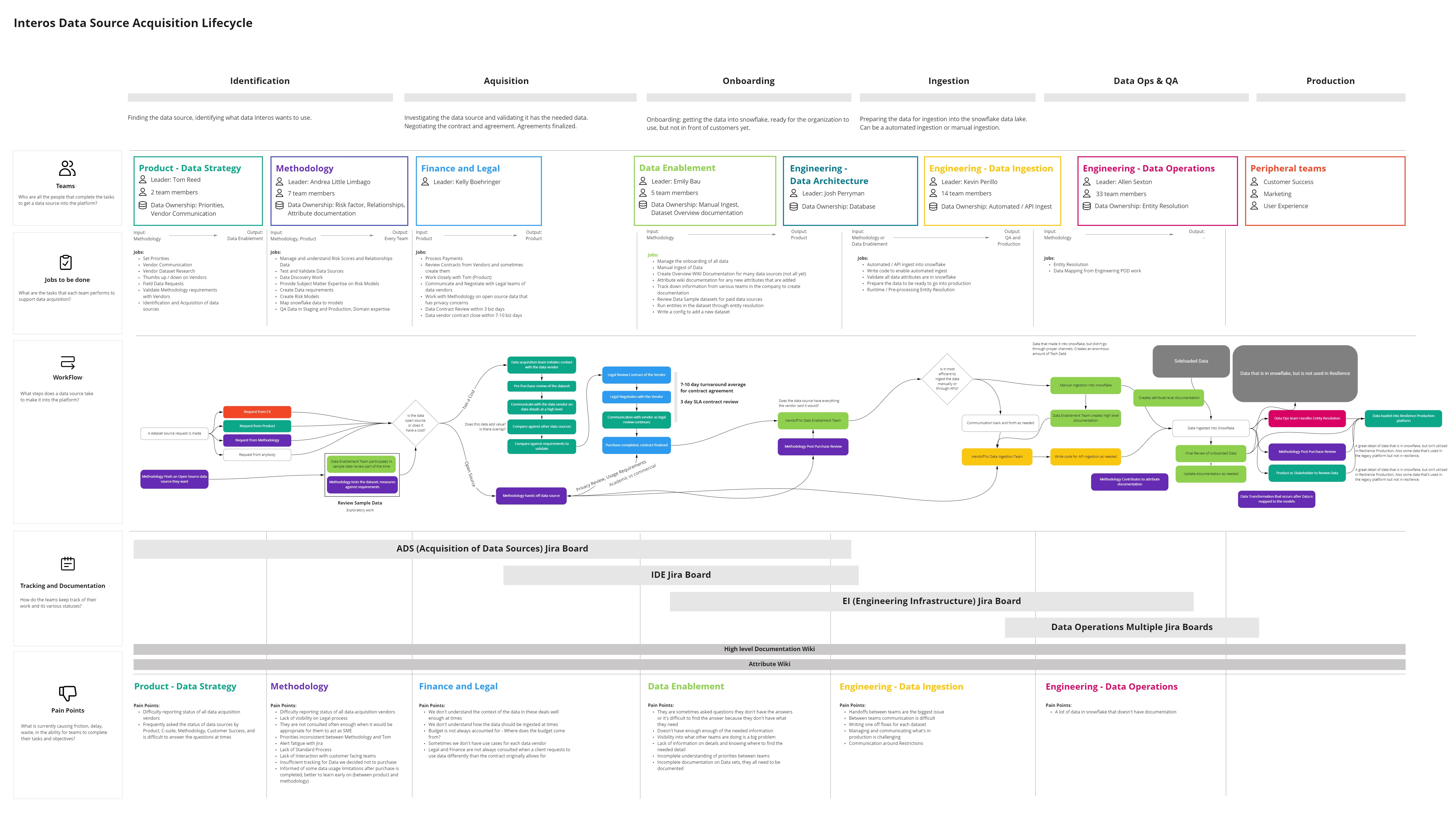
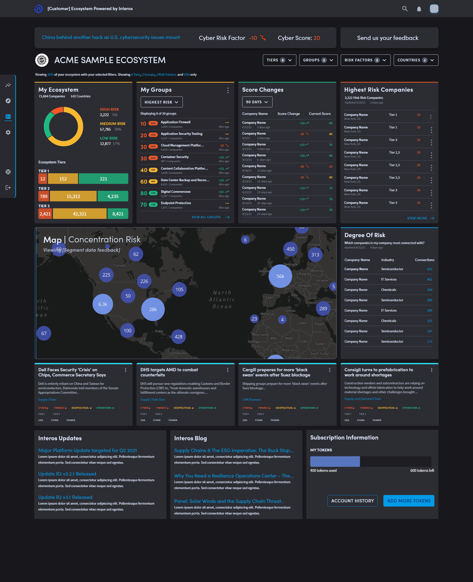
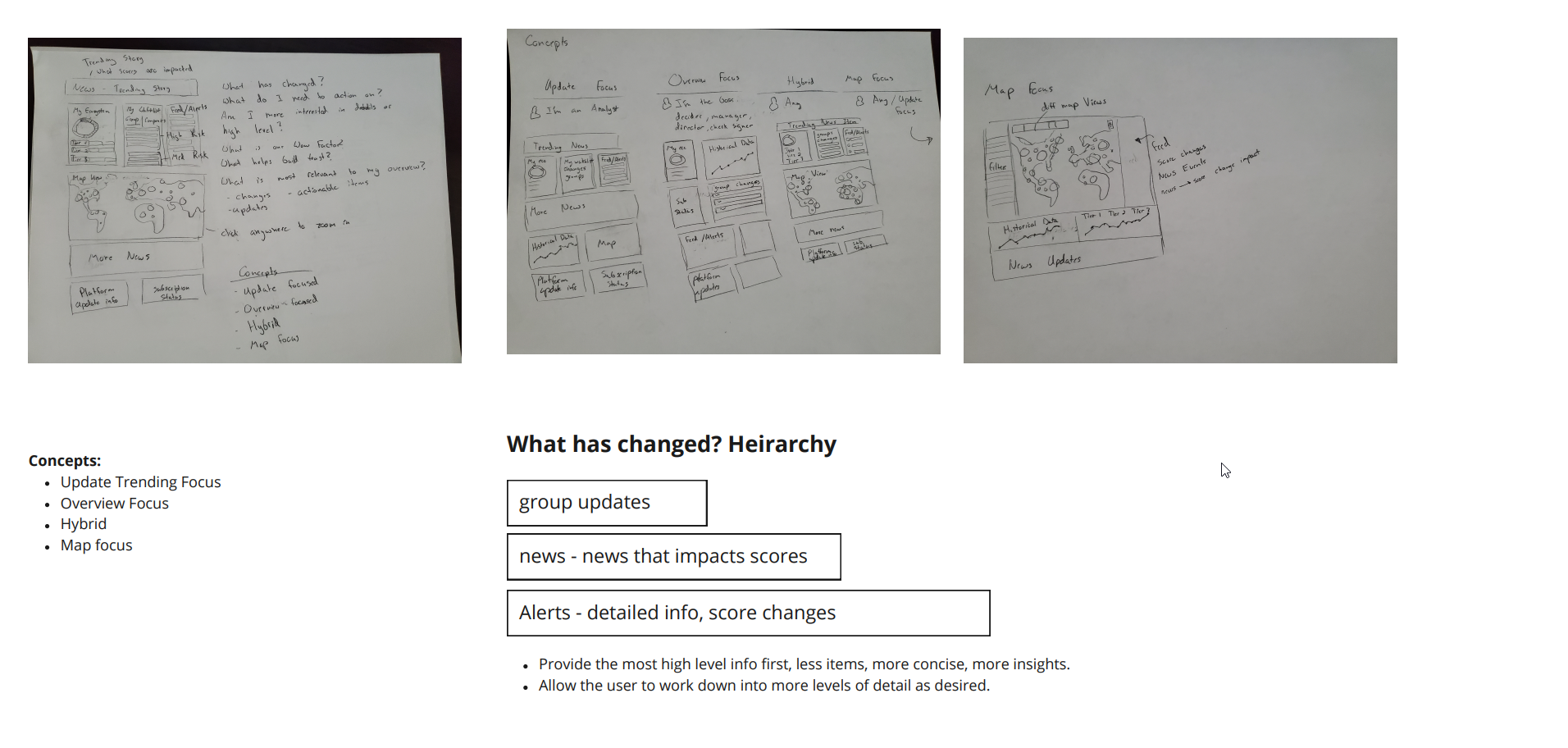
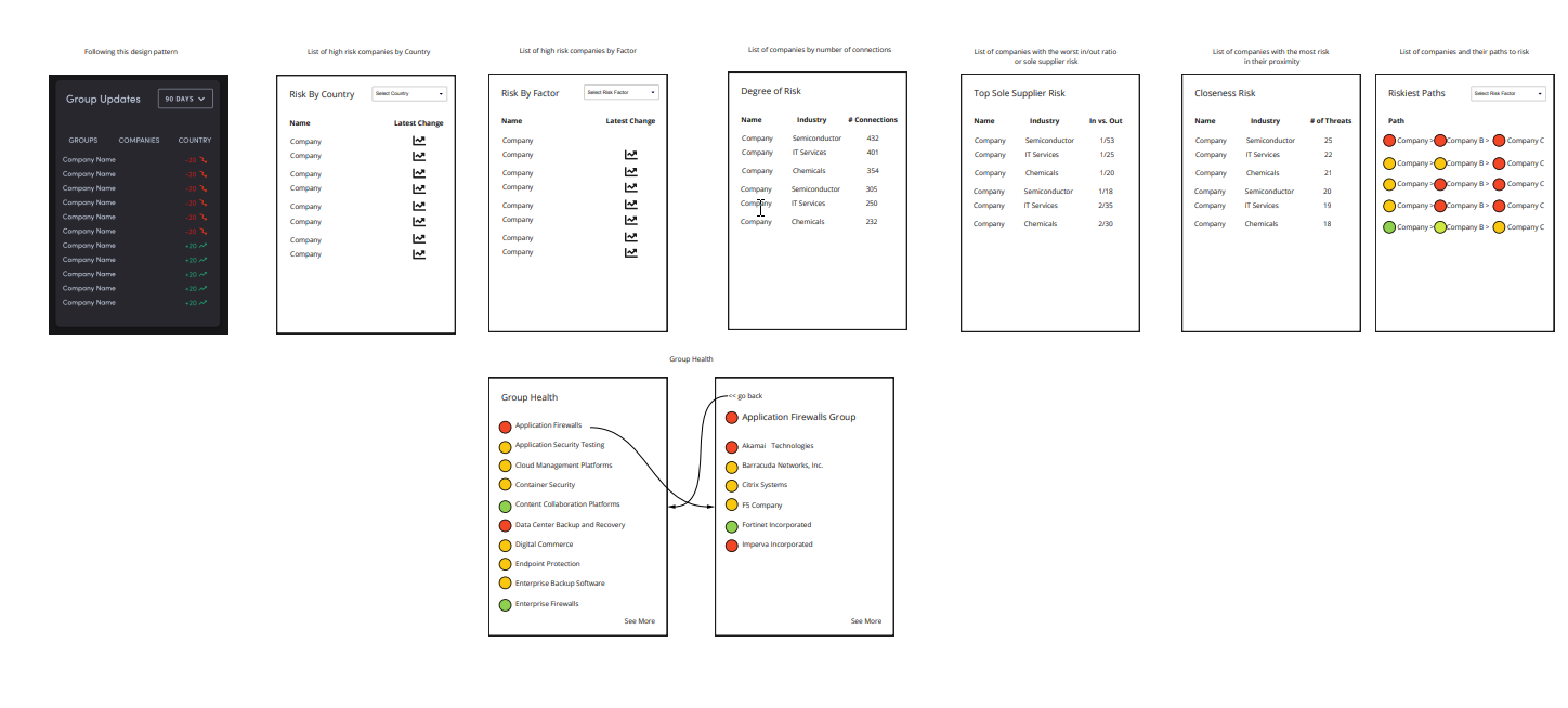
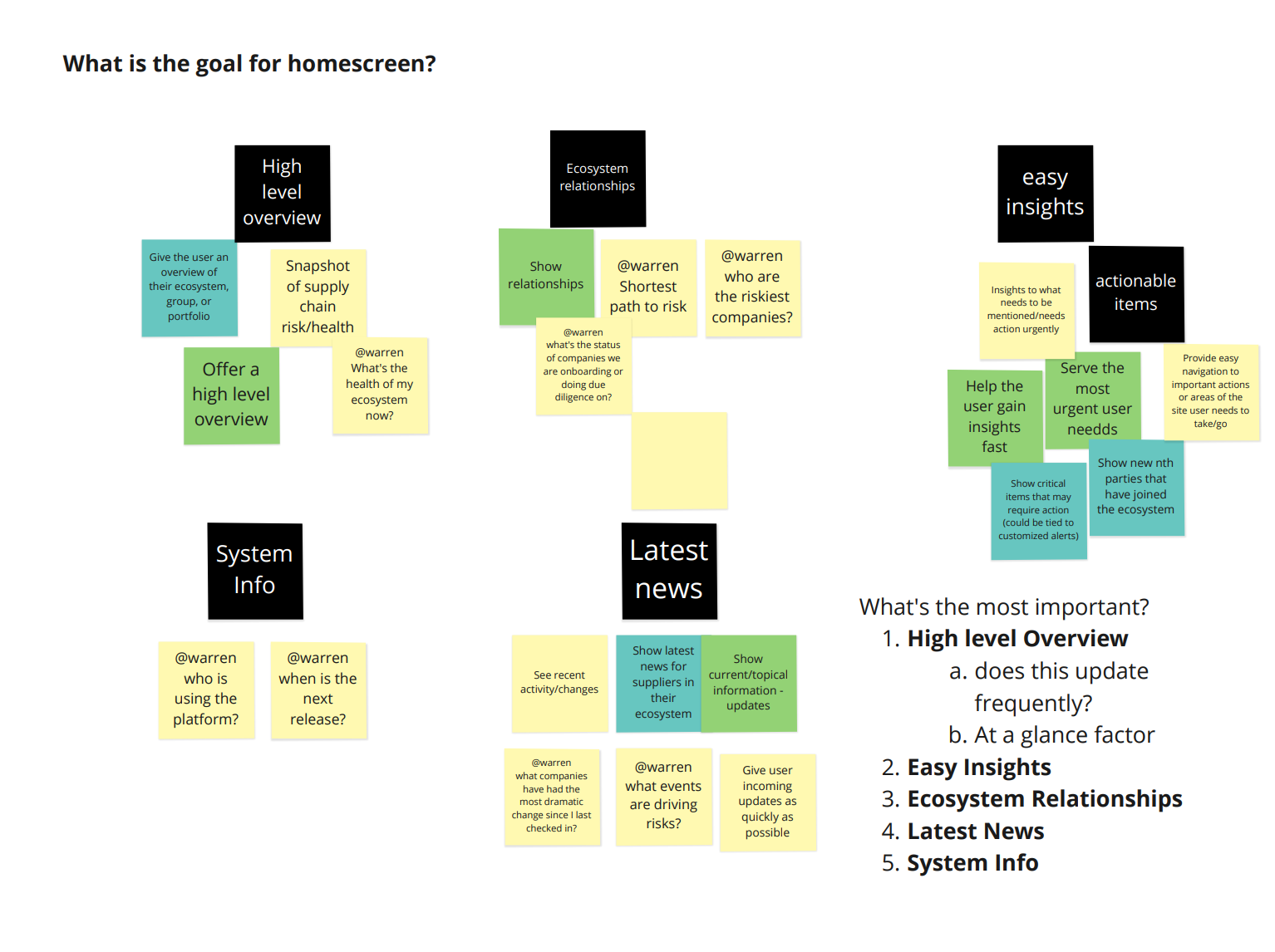
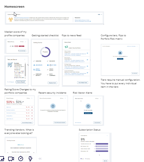
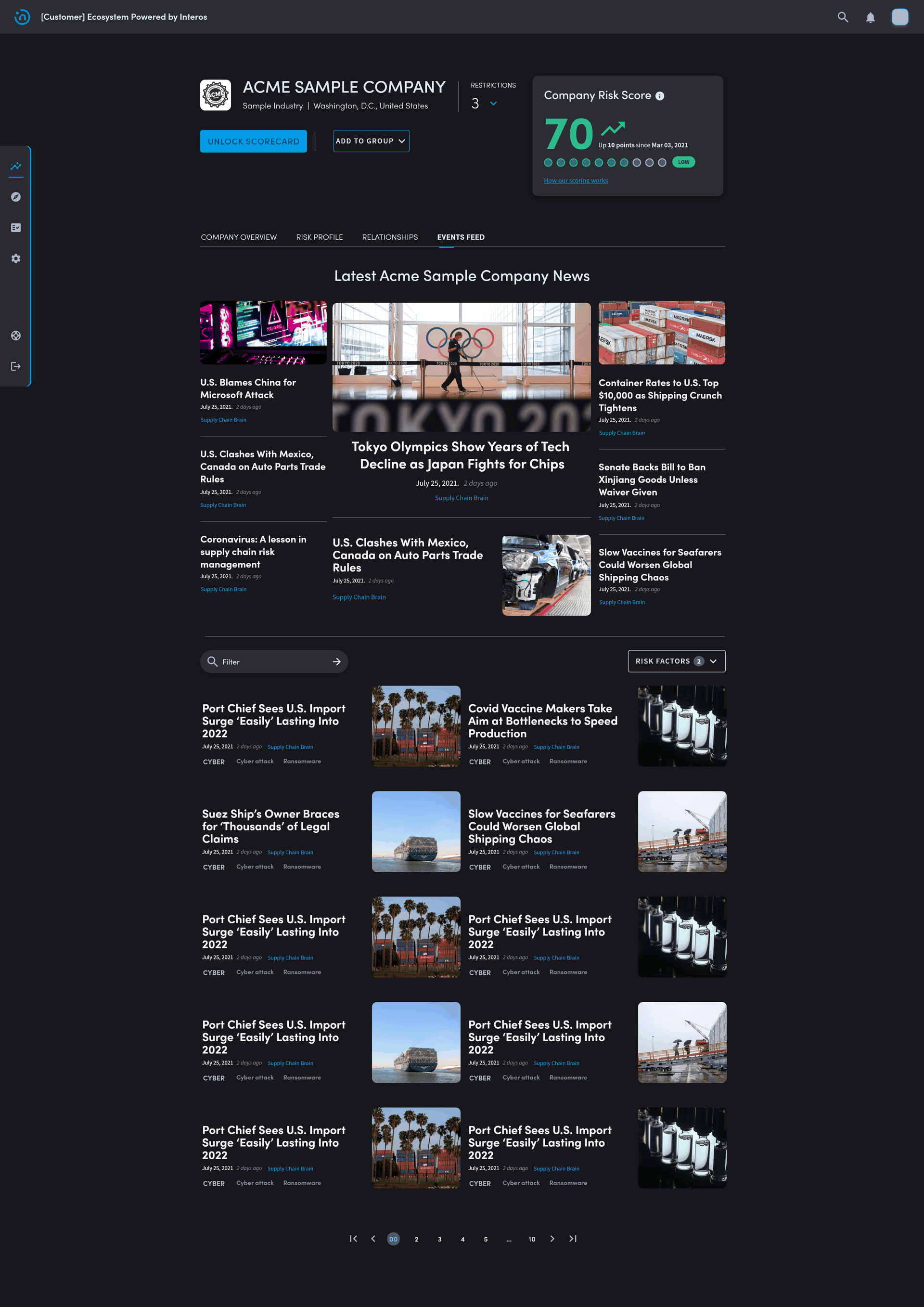
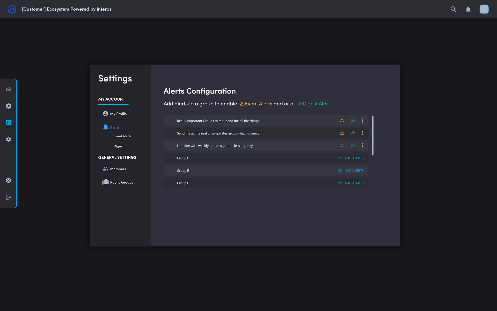
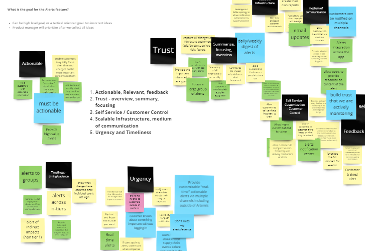
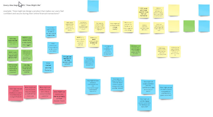
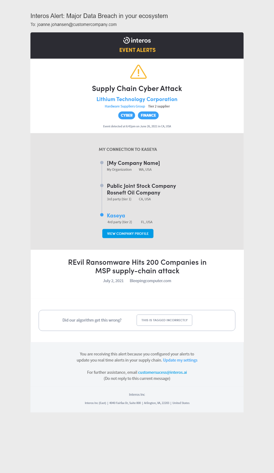
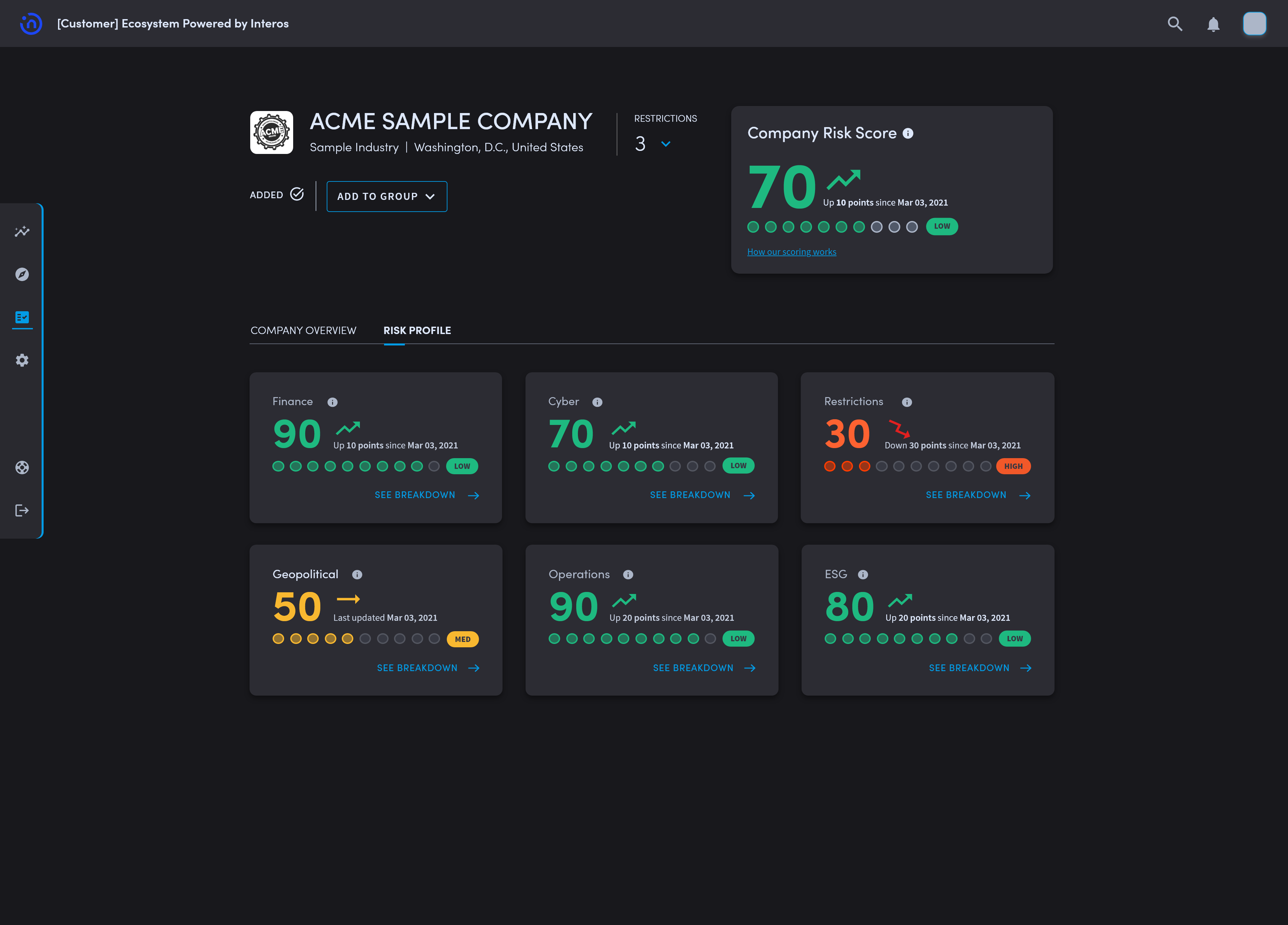
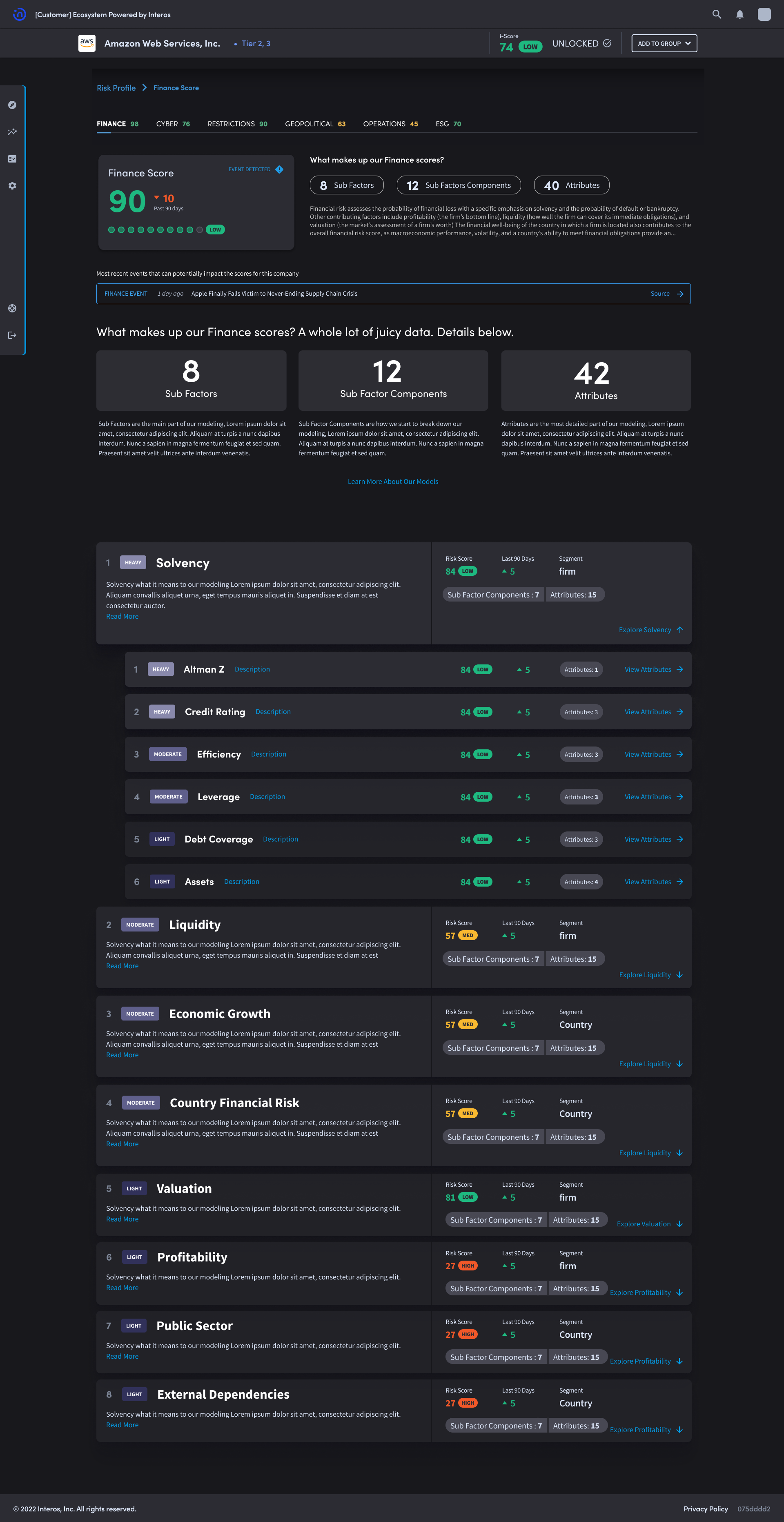
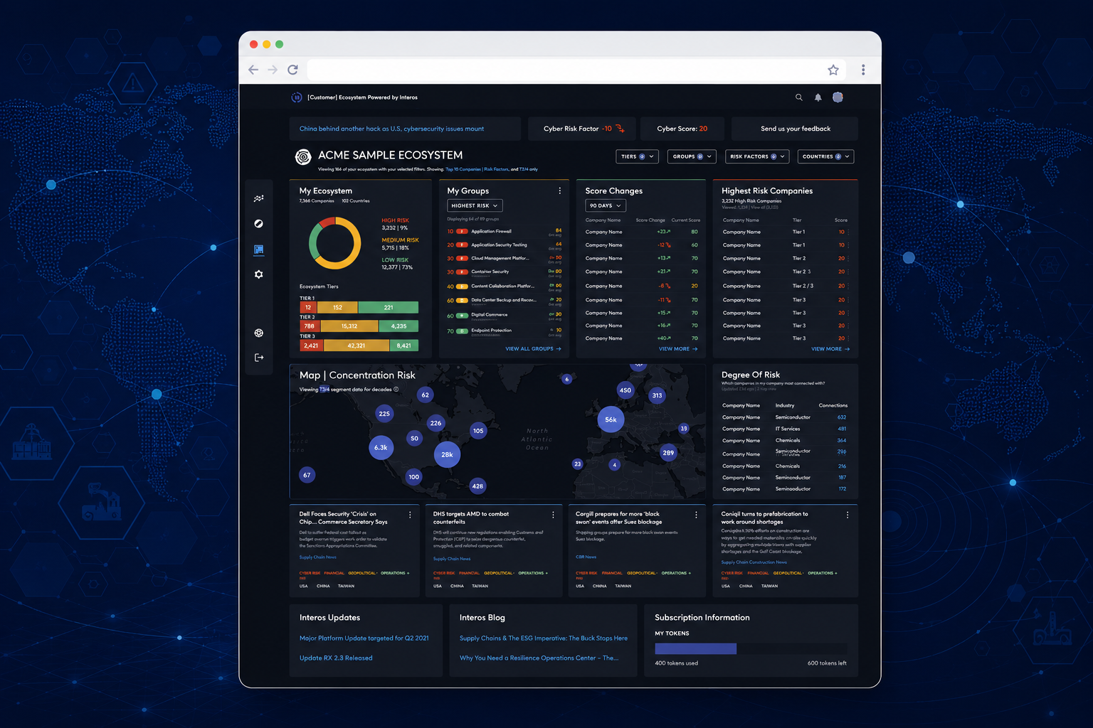
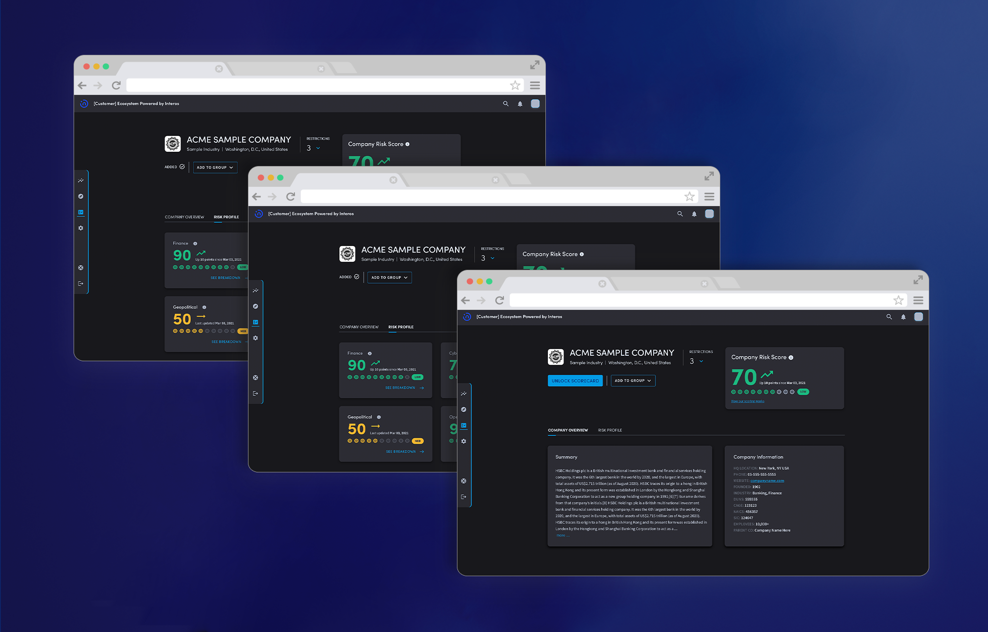
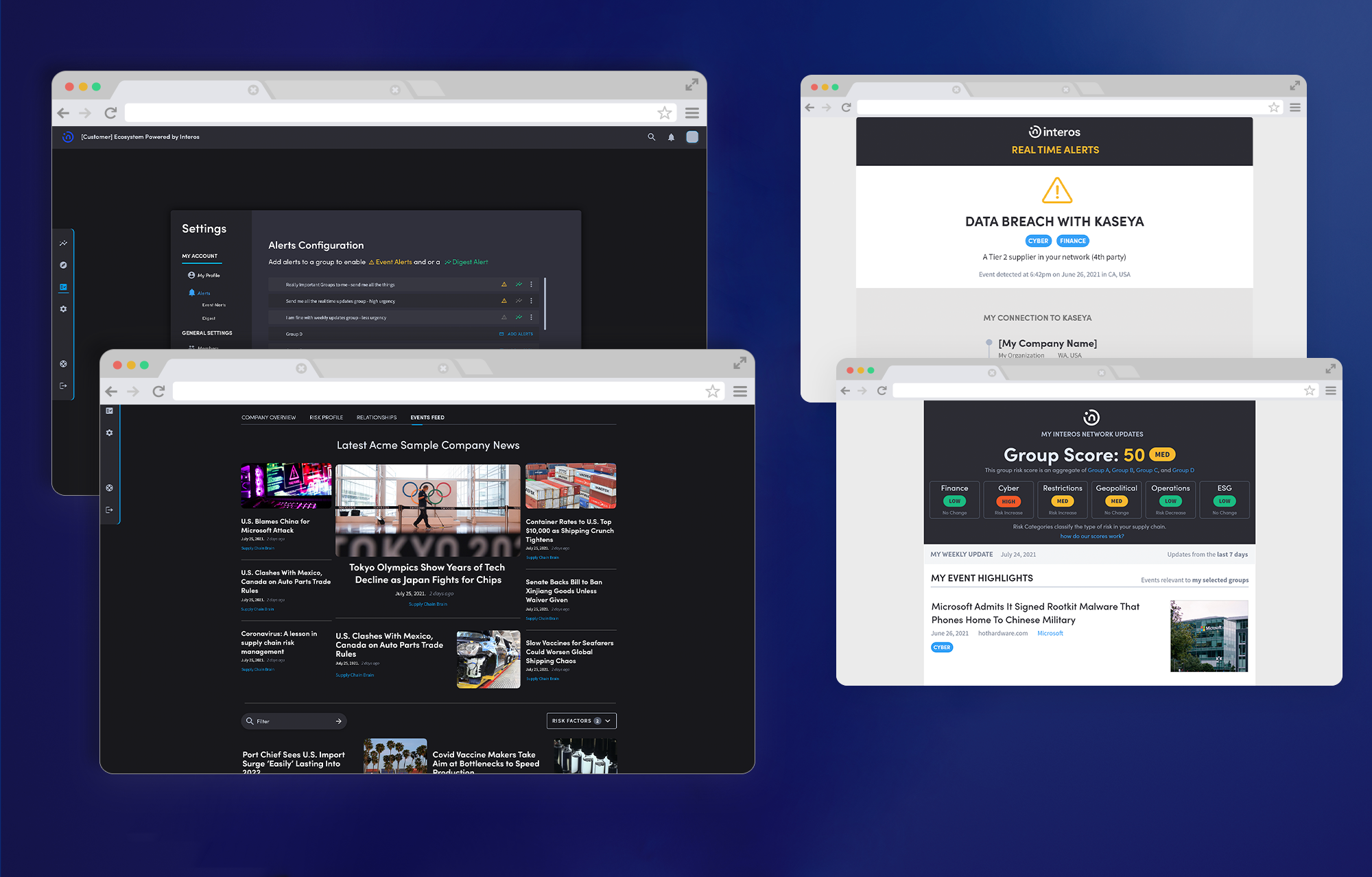
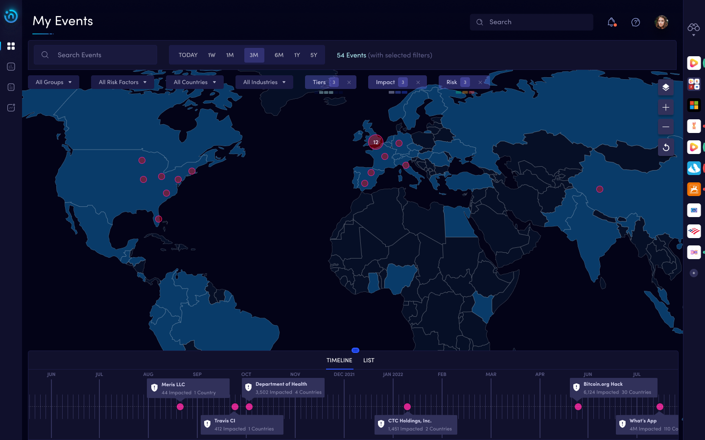
Supply chain risk data is inherently complex. A single enterprise customer might monitor thousands of suppliers across global tiers, each surfacing dozens of risk signals: ransomware events, sanction changes, labor violations, financial instability, sourcing dependencies. The challenge for Interos's new platform was making all of that legible to analyst power users at a glance, condensing complex datasets into meaningful aggregates without losing the fidelity those analysts needed to act.

What had been built before was a legacy platform that surfaced supplier data as rows of attributes with no narrative and no path to action. Analysts called it an Excel sheet with a portal wrapped around it. For a product selling clarity around supply chain risk, the v1 experience did the opposite of what it promised.

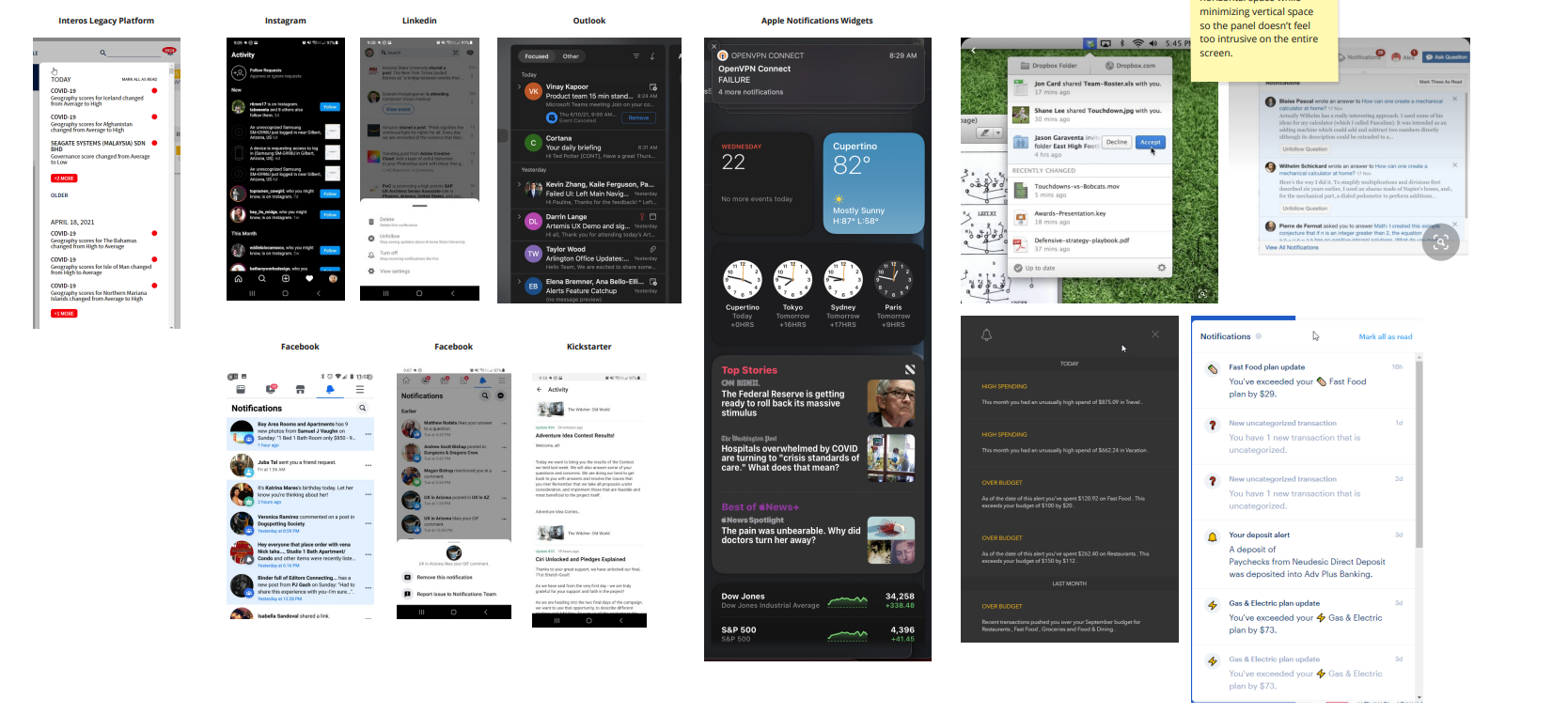
I joined through Neudesic in early 2021, embedded as a UX Feature Lead inside Interos's product team. The platform redesign was already underway. Pages were being built in parallel by multiple designers, including third parties. My role was bringing design coherence and quality to core pages, expanding the company's minimal design system as those pages shipped, and acting as a bridge between design and an engineering team that had historically worked in isolation from UX.

Five workstreams, one designer in the middle

What I owned
  • Design across 5 workstreams over 18 months: homescreen, company profile, alerts and notifications, events timeline, data lifecycle research
  • UX review process design and rollout, advocated through to VP of Product
  • Mentorship of a junior designer through tag-team collaboration across time zones
  • Expanding the existing minimal design system as new pages shipped
What I partnered on
  • Internal Interos design team and PMs across each workstream
  • Engineering leadership on the UX review proposal and implementation

The map nobody had

The most useful research wasn't about the product, it was about Interos itself. The company had grown fast enough that nobody had a clear picture of their own data acquisition process. Which sources had been purchased? Which were active? Who owned what? The answer depended entirely on who you asked.

I led a one-month engagement interviewing every department head across the data acquisition lifecycle. Mapped each team's role, identified where handoffs broke down, traced the process across every Jira board it touched. Output: an end-to-end journey map of the data lifecycle, with pain points annotated and recommendations structured as good, better, best so stakeholders at different investment levels could act on it.

That research clarified something about the product layer too. The core design challenge wasn't visual polish, it was data density. Supply chain risk is inherently complex. The job isn't to simplify it into something false. It's to give it enough structure that users can act on it. This framing shaped every workstream that followed: lead with risk posture at the aggregate level, surface the most urgent changes, allow drill-down only with intentional interaction. Progressive disclosure as a core principle, not a tactic.

The First 30 Seconds (Homescreen)

The homescreen sets the mental model for everything else. It's the most valuable real estate in the platform. I started with one question: what does a user need to know within 30 seconds of logging in?

That answer shaped everything. Supply chain analysts needed a fast read on their overall risk posture, not a list of raw scores. Executives needed a birds-eye snapshot. Managers needed to know what had changed since yesterday. The homescreen had to serve all three without fragmenting into three different products.

Three rounds of iteration, each tightening hierarchy, reducing noise, sharpening drill-down paths. The final design condensed the entire supply chain health picture into an aggregate that updated in real time, with clear entry points into the detail layers below.

Risk Doesn't Wait for You to Log In (Alerts + Events)

Supply chain risk doesn't respect business hours. A Tier 2 supplier gets hit by ransomware at 2 AM. Sanctions land over a weekend. If the platform only surfaces these events when someone logs in, the race is already lost.

The challenge wasn't sending notifications, it was signal-to-noise. Large enterprise supply chains could generate hundreds of events per day. Surface everything and users turn alerts off. Surface too little and they miss events that matter.

I designed a layered approach: in-app alerts for real-time awareness, an events timeline for browsing and research, and a branded email digest for staying current outside the platform. Each channel served a different attention state.

Configuration was where the design got tricky. Users needed granular control (risk categories, supplier tiers, severity thresholds) without the controls becoming as overwhelming as the data they filtered. After testing approaches with the product team, I landed on a tiered model: set global sensitivity, override at the category level when needed. Simple defaults, power-user depth underneath.

Inheriting Someone Else's Design (Company Profile)

I joined the company profile midway through development, inheriting another designer's half-finished work. The existing version had real problems: poor contrast, inconsistent hierarchy, dark UI patterns that weren't following established best practices. Risk score data didn't breathe.

I was also inheriting a collaboration arrangement. A junior designer on the east coast was already on the project. We worked tag-team across time zones; when he logged off, I took over. Getting him to a point where he could own decisions independently was as much a part of my contribution as the pixels I shipped.

The redesign established a proper dark UI system: layered backgrounds, consistent elevation, typographic hierarchy that made risk scores legible and actionable. Progressive disclosure as the core pattern. Surface the aggregate first. Gate detail behind intentional interaction.

Building the UX Review Process

Engineering at Interos had historically worked in isolation from UX. When I joined, engineers were not used to having their work reviewed by design. The existing culture was build-first, design-after. That gap between intent and what shipped was significant.

I worked with the team to propose a formal UX Review process: a quality checkpoint where design would review in-progress engineering work before it went to QA. Some old-school engineers pushed back hard. They perceived it as oversight they hadn't signed up for.

Getting it implemented required going above the immediate team. We brought the proposal to the VP of Product, who understood the cost of shipping broken design experiences to enterprise clients. With their backing, the UX Review became a standard part of the development cycle. Not without friction, but successfully.

In high-growth environments, the design work is only half the job. The other half is building the connective tissue that lets design actually ship.

A unicorn ships its new face

Platform V2 launched in July 2021, the first major redesign of the Interos product experience. Five workstreams delivered. A junior designer mentored through the engagement. A data lifecycle map that gave the company a single source of truth it didn't have before. The UX Review process running as a standard part of the development cycle.

The platform shipped looked nothing like the spreadsheet they started with. It had hierarchy, narrative, and a clear action path from aggregate to detail.

Interos reached unicorn status, $1B+ valuation, during the engagement. The work shipped inside that velocity. The UX Review process carried forward beyond my engagement, becoming part of how the company shipped product to enterprise clients.

Interos UX team, 2021

Designing inside companies that outpace themselves

Interos taught me what UX looks like inside a company outpacing its own process. The infrastructure to support good design was being built in real time while I was trying to use it. The most valuable skill I sharpened was designing for data density: finding the right level of abstraction for complex enterprise data so it becomes legible without losing fidelity. If I were starting over, I'd push harder earlier to expand the design system in step with the page work, so each new workstream inherited more shared structure than the last.

Details have been generalized and some visuals modified to respect confidentiality agreements.

← Back to all work
VASA Fitness app preview

Let's
talk.

Open to Senior or Staff UX design roles in enterprise, AI, or consumer. Available now.