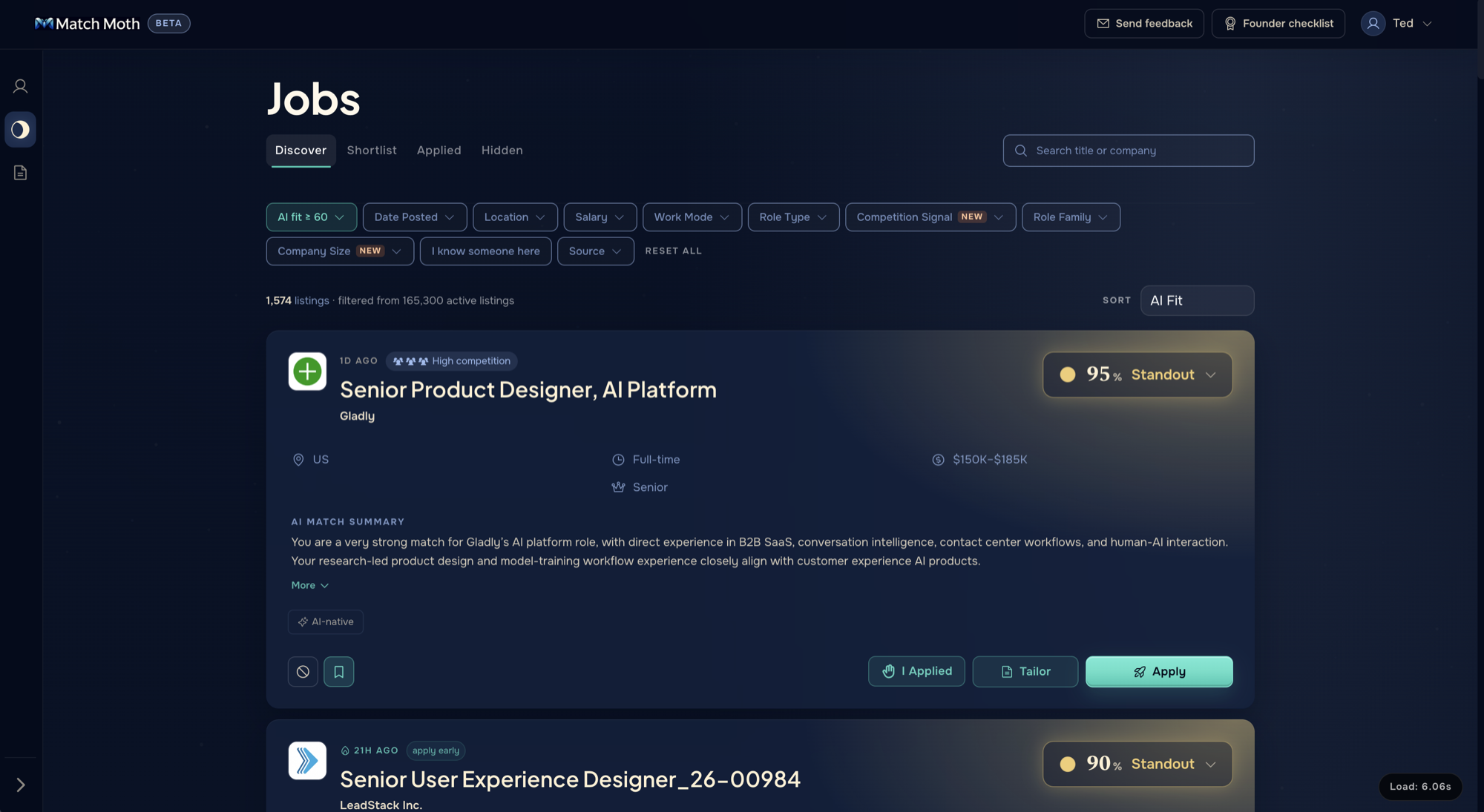
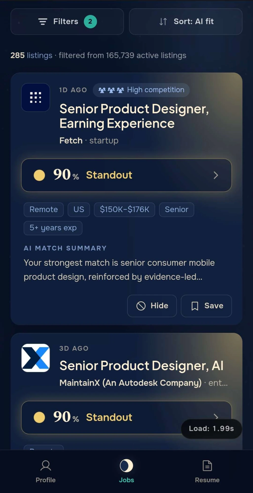
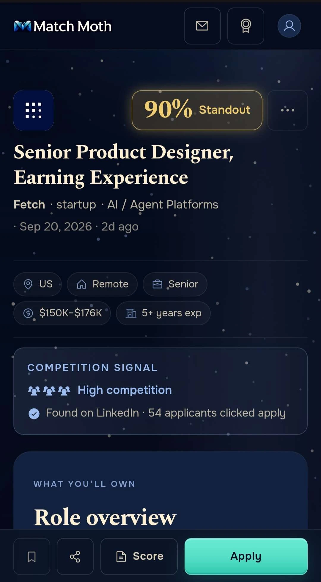
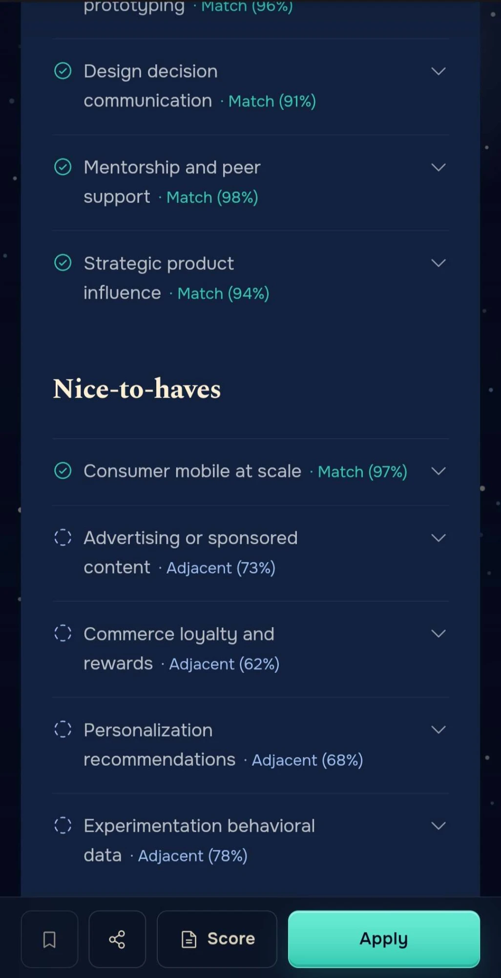
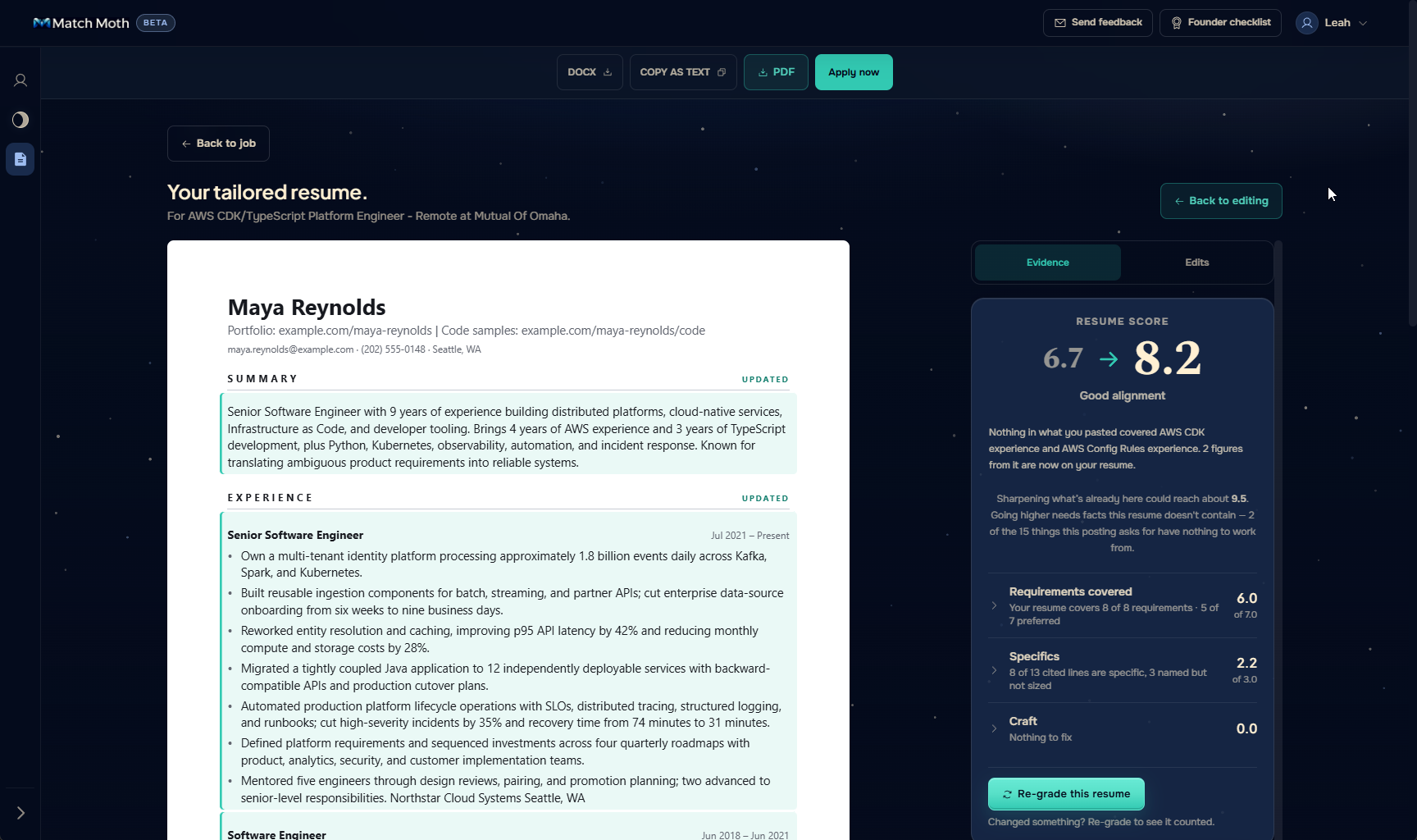
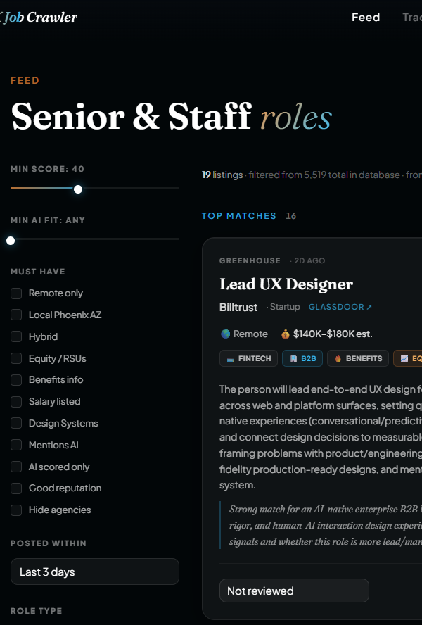
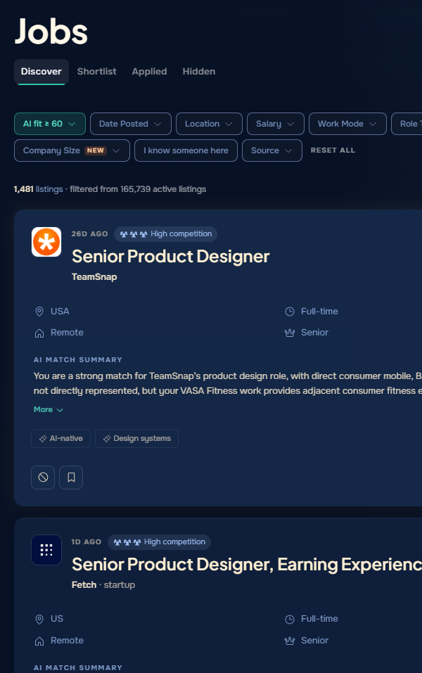
Match Moth reads a job seeker's resume, scores every listing against it, and breaks each score into the five factors behind it. It has been in open beta since August 2026, in one of the roughest tech markets in years. The design problem underneath is the one this page is about: making an AI judgment clear enough that a stranger trusts it and acts on it.
Live Demo
Try the real thing
Browse real listings and open any score to see the five factors behind it. Read-only, no sign-up.
more likely to be saved or applied to when the score calls a job a top match
48,000
dead listings caught and pulled from the feed in the last 30 days
170,000+
live listings from 50+ sources, 81% direct from ATS boards and careers sites
$0.08
AI scoring cost per user per day, under hard spend caps
168
components on one token file, shared by the app, the site, and the emails
Project
RoleProduct, design, and build, solo
UsersJob seekers in nine tech role families
StatusOpen beta since August 21, 2026
StackNext.js, TypeScript, Supabase, Vercel, Google Cloud Run worker
Built withClaude Code and Codex; OpenAI (gpt-5.6-luna) for scoring and resume work
ScopeI designed and shipped the full front end, the design system, the email templates, and the accessibility gates in the build. Agents wrote most of the code to my specs; the pipeline and scoring worker run on Google Cloud Run.
The Problem
Search is an attention problem
Job seekers spend about six hours a week on the search, and most of it goes to filtering, not pursuing. In 2026 polling, 46% named "finding opportunities that match my qualifications" as their top challenge, ahead of pay or interviews (Express Employment Professionals / Harris Poll). The right roles exist. Finding yours in the noise is the work, and mainstream tools push that work onto the person with the least time to spare.
The market's answer is volume. Mass-apply tools promise fifty applications a night, and they sell because the pain is real. The results are not. Apply-to-interview rates have collapsed as the flood rose, and every automated application makes the next one worth less. Match Moth is the opposite bet: fewer, better-aimed applications, chosen with a score that shows its work. It's LLM-as-judge with a person making the final call, the same evaluation problem I design for professionally.
Origin
It started as a tool for one
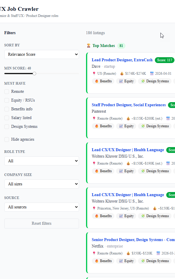
It started as a proof of concept: my resume hardcoded, a nightly crawl of a few thousand companies, and a ranked email every morning. It worked. I reviewed a shortlist in minutes instead of scrolling for an hour, and the roles I wanted rose to the top on their own. It worked because I already trusted the judge: I'd written the scoring rules and could see why every role landed where it did. Then I opened it to other job seekers in other roles, and nearly every decision below came from what happened when they walked through the door. They hadn't written the rules. The score had to earn the trust I'd given it for free.
AI Job-Fit
Every score, broken down
What a number means
A single 0 to 100 is a verdict, and a verdict invites exactly one question: why? So the score is five factors, with the weights shown on every breakdown: skills 35, seniority 20, compensation 20, industry 15, location 10. Two come from the model, skills and industry, because they need a reading of the posting against your resume. Three are deterministic checks against your own preferences: seniority against your target, salary against your floor, and work mode and location against where you'll actually work. If you can't relocate, onsite and hybrid jobs in another state don't need to show up in your feed.
Your dealbreakers, checked first
At setup you tell Match Moth three things your resume can't: where you'll work, the least you'll accept, and whether you want to build or manage. The score measures fit with what you've done, but it can't know what you'd turn down. So beside every score sit three labels checking the job against those answers, each passing or warning, plus a one-line verdict. A role can score high on skills while its label says it's onsite in a city you ruled out. You see both at once, so a high number can't hide a dealbreaker.
Off-target0–49Worth a look50–69Promising70–84Standout85–100
Bands on the adjusted score. A 60-day-old listing at raw 80 reads as Worth a look, not Promising.
Bands
Your first feed targets Promising and above. Most listings are mediocre fits, and the score says so: the median real user's median score is 55, below that floor. The bands appear to mean something to people. Real users save or apply to Standout listings at 1.3%, against 0.08% for Promising, about 16 times the rate. Of the 43 times a real user has clicked through to apply, 40 were on a Standout or Promising listing and none were on an Off-target one. The caveats: it's only a month of open beta, there's no impression log yet, and the denominator is every scored row rather than every row seen.
One thing the numbers don't say yet is whether people read the breakdown or just the number. The 16× gap shows the bands sort well. It doesn't show that the five factors are what earned the click. The breakdown-open event ships in the next spec, and the October revision of this page will say whether transparency is doing the work or the number is doing it alone.
At Scale
What changed when strangers showed up
Data quality is a UX feature. A score is only as trustworthy as the listing under it. If the feed shows a job that closed a month ago, the user doesn't blame the crawler, they stop trusting the score. So the quality work below is design work that happened to ship as pipeline code. Every rule here answers the same question: what would make a stranger stop believing the number?
One job is one listing. A staffing network publishes a single requisition to a separate page for each city, and aggregators ingest every page. Two pages for the same job, one in Annapolis and one in Montgomery, matched down to the reference ID. Fixing that took one firm from 660 listings to 87, and onsite jobs now show the city the employer named, not the one an aggregator guessed. Dead listings are closed nightly: 48,000 in the last 30 days.
Per-user scoring means per-user cost. One person's score is worth nothing to anyone else, so every listing is judged against every resume. A recall-tuned keyword gate runs first, so only directionally fit listings reach the model, and hard per-user and global spend stops sit underneath it. That works out to about $0.08 in AI cost per user per day. The cap is a product decision as much as a budget one: a score that costs too much to run is a score nobody gets.
The pipeline: crawl, dedup, per-user scoring on a Cloud Run worker, then the feed and the morning email.
50+ sources across 29,000 companies: ATS boards, employer careers sites, and aggregators. 81% of live listings come straight from the employer's own board, the canonical copy before a role syndicates out and goes stale. 63% carry a salary.
Competition, with the evidence shown. Each listing says whether the same job was found on LinkedIn and Indeed, one line per site, with LinkedIn's applicant count when it publishes one. The icons are deliberately not green and red, because being found on a site means more competition, not less. If a search doesn't finish, the result is treated as unknown rather than "not found," and the check runs again later. Unknown and absent are different states, and the UI says which one it is.
Onboarding
The onboarding bet I got wrong
How people arrived. I posted my own story on LinkedIn and Reddit, and replied as a person in threads where people were describing the same job-search pain, with no pitch unless someone asked. One Reddit post reached about 5,000 views, sat briefly at the top of its subreddit, and brought 15 signups in 24 hours. Most of them arrived on a phone, from inside a social app, which is the context for everything below.
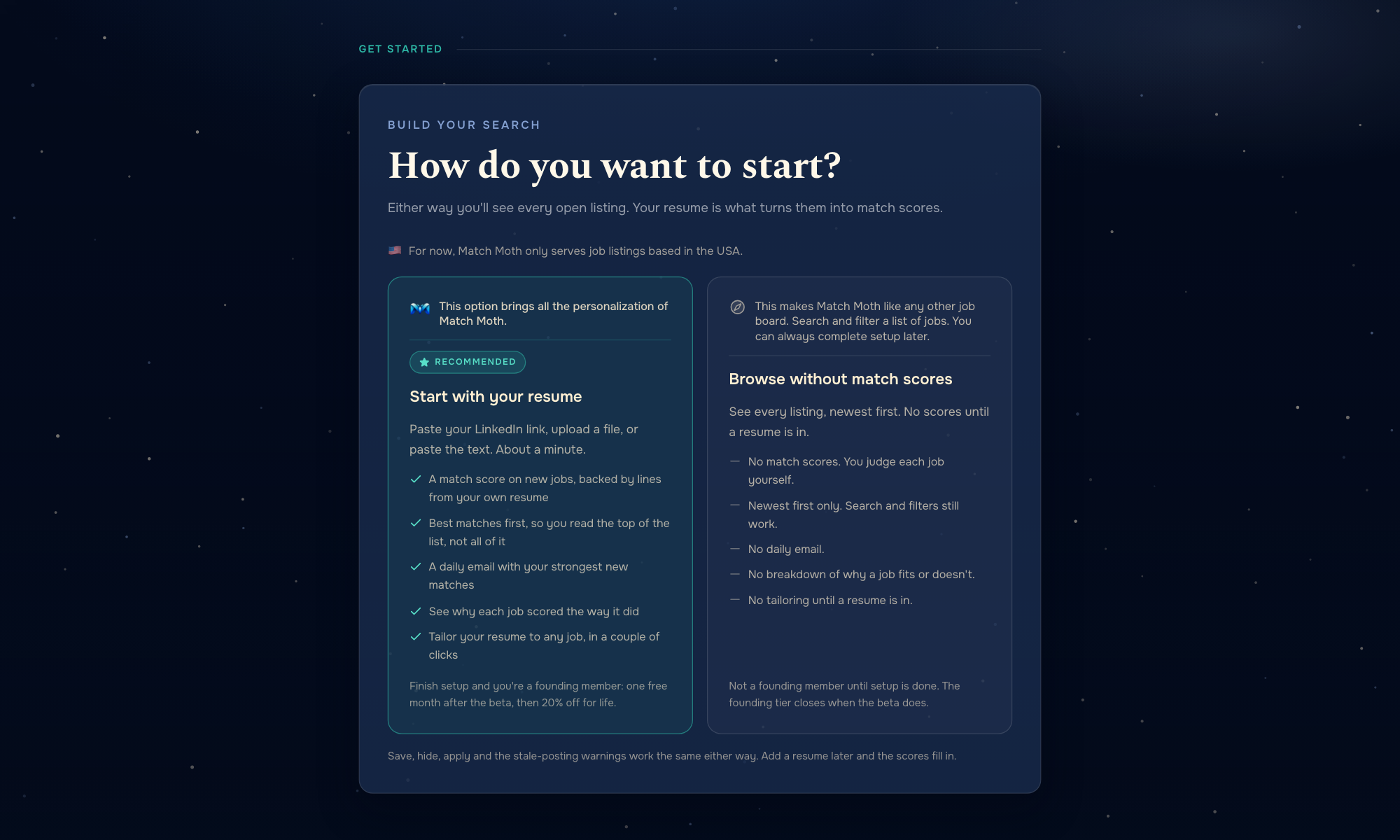
The bet. Resume-first and mandatory. The resume is the primary scoring evidence, so the product asked for it before showing anything, and pre-filled preferences from it so setup took two minutes. I bet the value was obvious enough to earn the upload up front.
What users did. 38% of real signups uploaded a resume. Until the skip shipped, that meant 62% of signups never saw a feed. Every deferral happened at the resume step, and 10 of 12 were on a phone. Every resume that was uploaded parsed cleanly, whether PDF, DOCX, or a LinkedIn import. The parser was fine. Finding and uploading a file on a phone before seeing a single job was the wall.
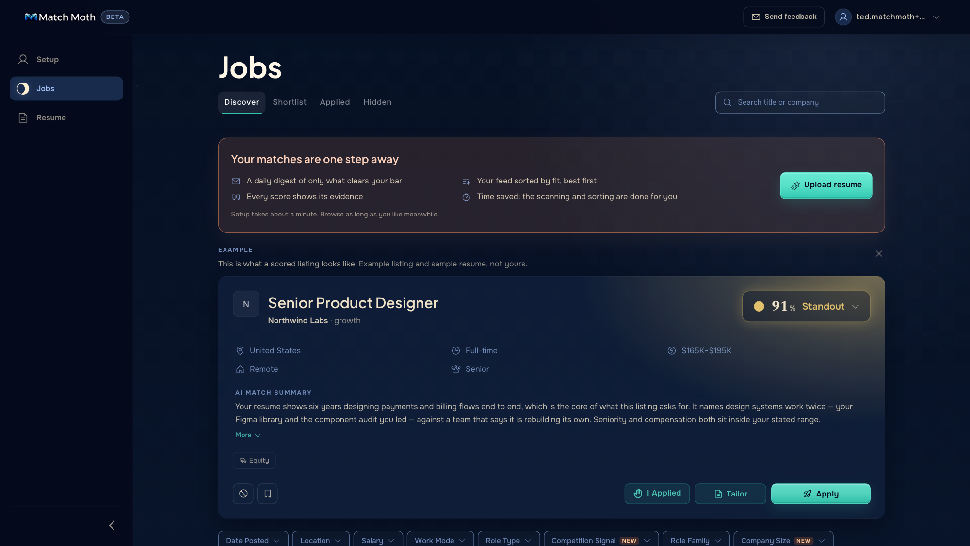
What you'd see now. If you sign up today, the first screen tells you what each door opens: add your resume and every job gets scored against it, or browse without scores. Both cards say what you get and what you give up. If you skip, the feed says so plainly, shows one scored example, and keeps a way back to setup in view. Nineteen people have come through since that changed. More of them finished the resume step than before, but three changes landed in the same week, so I can't tell you which one did it. The next step is asking skippers why they skipped, so the answer comes from them and not from my guess.
Operations
Designing for the operator too
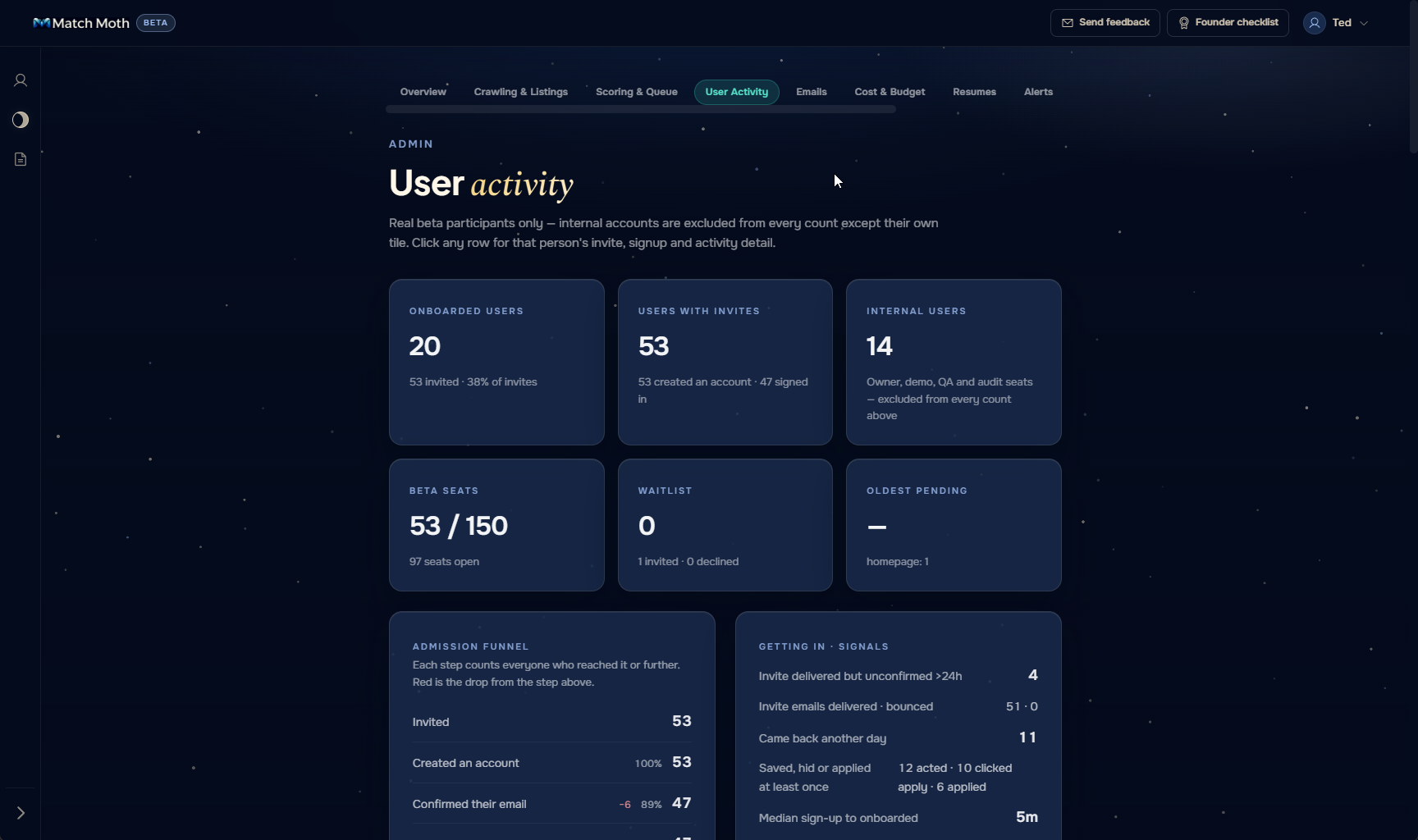
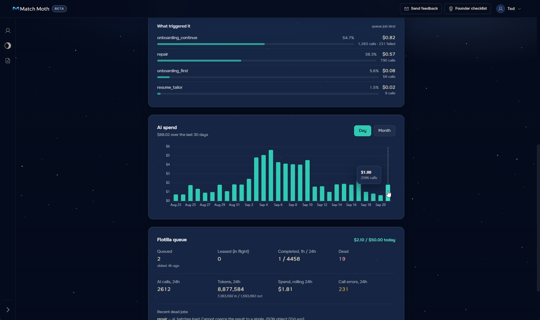
A live product has a second user, the person who runs it. An admin status page shows queue depth, AI spend against its caps, captured exceptions, and email delivery health, so a bad morning is diagnosable before a user reports it. Three beta bug reports since September 1, on profile fields, the resume editor, and a dead Workday link, each got a fix the same day or within days.
The Craft
From a tool to a brand
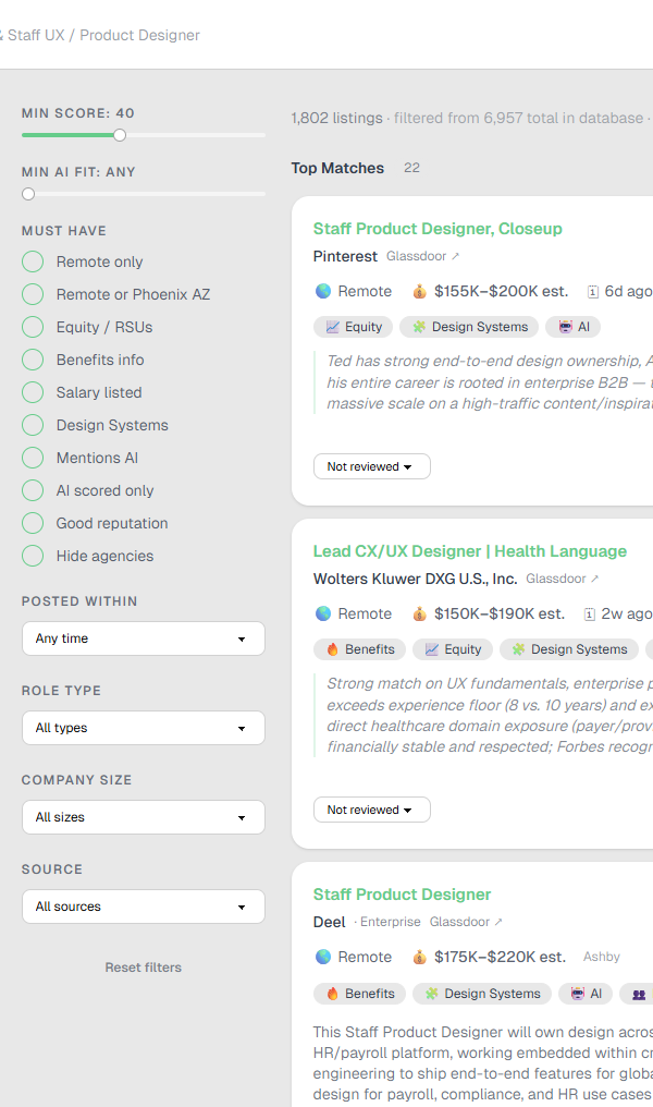
The first UI was a component-library default and looked like one. For a tool I'd open every morning that wasn't good enough, so it went through three generations in two months: an unstyled proof of concept, a DaisyUI pass that made it usable, and a dark rebuild in the style of my portfolio, with the interaction details that make something feel considered.
The fourth generation came with strangers. A tool for one can borrow its owner's taste, but once strangers were using it, it needed a brand that says what the score says. Match Moth is a moth steering by a truer light through a noisy night, discernment rather than attraction to the brightest thing, and the promise underneath is four words: match better, apply less. The moth mark shipped on September 7.
Design System
One decision, made once
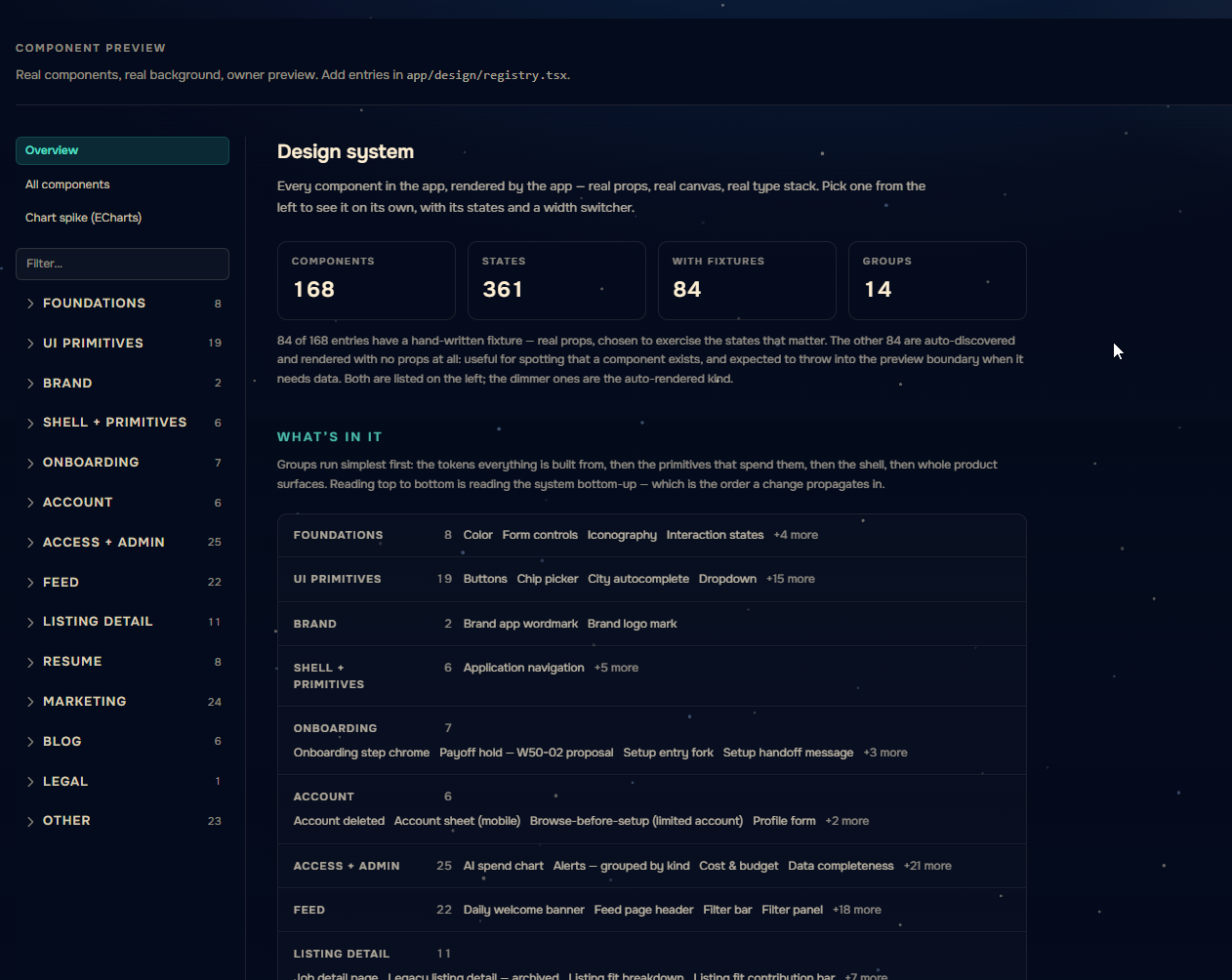
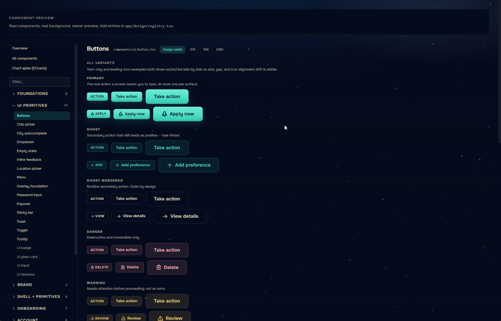
A product that scores honestly needs a surface that behaves the same everywhere, so the brand and the design system were built together, and I built them in code. Every color and type decision lives in one token file that the marketing site, the app, and the emails all read from. Change a token once and it shows up the same way in all 168 components, 361 states, without me touching each one. I could describe a rule in a sentence, like what gold is allowed to mean, and have agents apply it across the product overnight, then judge the result myself the next morning on the real canvas.
The design route is where that judging happens: every component, every state, at 375, 768, and 1280. It's a Figma file that can't drift from production because it is production. In late August an agent audited the system against its own rules and scored it 65 out of 100. By that evening it was 82, mostly from 107 contrast fixes across 37 files. The biggest finding needed no code at all. The rule was wrong, not the product, so the docs were rewritten to match the design that had already won.
Accessibility got the same treatment as the score: measured, then reported honestly. The August audit passed on keyboard focus and failed on contrast, worst of all on the score badge itself at 2.46:1, and on form errors announced to nobody on seven of nine surfaces. Error announcements were fixed the same day. Contrast failures now break the build, so a regression can't ship without someone deciding to ship it. No match is graded by color alone. A screen-reader pass is still to do, and this page will say so until it's done.
Spec as contract. Decisions get written down so they aren't re-argued.
Process
Spec-driven development with AI
AI writes most of the code, so the documentation is the project's memory. Every phase starts as a spec: the problem, the measurements behind it, the plan, and a decisions log where each ruling gets a dated row so no later session re-argues it. 78 specs have shipped and 27 are waiting, which is the backlog. Every ship adds a changelog entry with the reason and the before-and-after numbers, over 1,000 entries in five months, alongside 58 research documents and 144 QA reports. Agents build overnight on a branch against the spec, a Playwright run checks the golden path, and every morning starts with my eyes on what landed. AI doesn't flag its own bad decisions. You find them by paying attention.
None of this is new to me; it's the operating model I'd run with a team of people. The spec is the contract, the decisions log is why the same argument doesn't happen twice, and the review gate before ship is the UX Review checkpoint I stood up at Invoca, where design saw engineering work before QA did. The agents just made it cheap enough to do all of it, every time, on a project of one.
Outcome
What the first month changed
As of September 22: 53 real signups, 20 onboarded, and 43 apply clicks.
Retention isn't measurable yet. The first four-week cohort lands in late September, and this page gets a revision in mid-October with that data, an impression log, breakdown-open rates, and skip reasons from the people who skipped.
What a month of strangers changed, in order of how much it hurt:
The resume wall came down. I bet the value was obvious enough to earn an upload up front. 62% of signups said otherwise, and most of them said it from a phone. The product now shows what each door opens and lets people choose.
The score got a conscience. The number measures fit with what you've done. It can't know what you'd turn down, so the dealbreaker labels now sit beside it and can't be hidden by a high score.
Unknown stopped meaning no. A competition check that didn't finish used to read as "not found." Now it reads as unknown and runs again. Small, but it's the difference between an honest signal and a confident wrong one.
What the product can't fix: employer silence and the market's odds. No seeker-side tool makes a recruiter reply.
The page opened with one question: can a stranger trust an AI judgment enough to act on it? A month in, the bands sort, the dealbreakers hold, and 40 of 43 apply clicks went where the score said they should. Whether people trust the why and not just the number is what October has to answer.